DESIGN BLOG
Inspiration, Trends, Thoughts
&
Musings
Pantone Colour of the Year 2020 - Classic Blue
Pantone has chosen their colour prediction for 2020 and it’s as reassuring and comforting as Grandma’s cooking!
If you’re as interior obsessed as we are at the office, then you may already know that Pantone has released their new colour prediction for 2020 – Classic Blue! Pantone’s predictions can set the tone for the year in what will be trending within fashion, textiles, art and design…
If you’re as interior obsessed as we are at the office, then you may already know that Pantone has released their new colour prediction for 2020 – Classic Blue! Each year, the Pantone Colour Institute who consists of 5 committee members determine a colour through extensive trend forecasting research. Their predictions can set the tone for the year in what will be trending within fashion, textiles, art and design.
“A reassuring presence instilling calm,
confidence and connection” - Pantone
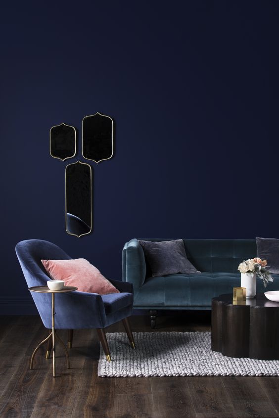
Blue is one of the most loved colours on the colour wheel! It can be applied to almost any environment and offers a range of shades that will suit your every interior need. Pantone 19-4052 or commonly referred to as Classic Blue, instills a sense of calmness and tranquility. Even the Classic Blue name describes its comforting aspect, bringing nostalgic images of a simpler time.
HOW DOES IT WORK?
Picture Source: Pantone
You might be asking why does Pantone release their colour of the year and how is it chosen? Well, you’re in luck because we’ve done our research! The Pantone Colour Institute are made up of psychologists, fashion designers, interior designers, product and merchandise developers. Generally, the process takes around 9 months and commences early on in March. The Committee travels all over the world including Milan, New York and Paris for research. The colour is then chosen based on where we are culturally at the moment. Previous years have seen the colour of the year named as ‘Living Coral’ for 2019 or the year Pantone made history by choosing 2 colours - ‘Rose Quartz and Serenity’ for 2016. This year, they chose Classic Blue to serve as a reminder, to pause, to take time to be in the moment and have open communication with those around us. Especially, in a world that is progressing quickly with technology.
“Brings a sense of peace and tranquility to the
human spirit, offering refuge” - Pantone
A new colour is not created for the Colour of the Year but is instead picked from within the 1,867 colours already existing within the Pantone library. Once the committee has chosen their colour and made their decision, they commence looking for proof within culture, justifying their choice.
DID YOU KNOW?
All about Colour Psychology
Colours can have an impact on our moods, make us feel different emotions and bring up specific thoughts? This all comes down to a little thing called Colour Psychology!
When you think of the colour blue, images of the ocean may pop up and a sense of peacefulness and serenity may wash over you. This is the basics of how colour psychology works and different colours will bring different images and feelings to mind.
Picture Source: Prince Design Instagram
In particular, the colour blue is usually associated with being peaceful, tranquil and serene. Some of its other most common qualities include productivity, sadness, calmness and stability. Despite being one of the most popular colours, blue can get a bad rep. Most of the time it’s overlooked and quickly dismissed. However, it is extremely versatile and its effects on your emotional psyche can be on completely opposite ends of the spectrum. Either making you feel really happy, productive and peaceful or melancholic, sad and contemplative.
Another fun fact we thought you might like to know, is that blue can actually help lower your pulse rate and body temperature!
“…A solid and dependable blue hue we can always rely on” - Pantone
I LOVE THE COLOUR!
BUT TELL ME HOW TO USE IT IN MY OWN HOME
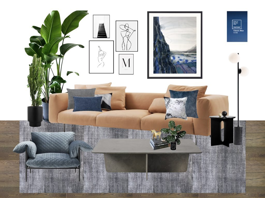
We’ve got you covered! We love talking all things design, so we had a lot of fun in coming up with different ways for you to apply the Pantone Colour of the Year to your own home. Most people will commonly associate blue with the ‘Hamptons and Coastal’ themed interiors. However, we’re here to show you that it can be applied to so much more! We recently showcased a mood board displaying a contemporary edgy design for an interior colour scheme. And we’ve taken the time to research more ways of introducing this versatile colour of the year in a multitude of interiors. Scroll down to see them!
Moodboard inspired by a Contemporary Edgy design
Picture Source: Prince Design Instagram
A Bathroom shot that we are loving!
Featuring large format blue tiles that display an aged plastered look for the walls, which has been perfectly paired with black modern accessories, to showcase a sleek European look.
Picture Source: Pinterest
OUR PICKS FOR 2020 ….
As we previously mentioned before, blue doesn’t have to mean that you are pigeonholed into a certain design style. It can be fun and exciting! Blue is such a versatile colour that it works so well with almost any colour scheme. The new Indulge Palette and the Grounded Palette from Dulux is one that will perfectly complement any shades of this hue.
The Terracotta and Berry tones from the Dulux Indulge Palette are a match made in heaven for the Classic Blue. However, if you’re after a more subtle colour palette, then you can’t go wrong with pairing it with the greys and neutrals from the Dulux Grounded Palette.
HOMEWARES, ACCESSORIES AND DECOR
Classic Blue can be applied to your home through homewares, art, cushions and paints. We have compiled a list below of our favourite picks of Classic Blue homewares and decor pieces for inspiration!
We also featured Classic Blue in our 2019 Trend Alert Blog under the Twilight Palette. Be sure to check it out for more great ideas! To see more of our top picks for 2020, click on the button below to head to our Pantone Colour of the Year Pinterest Board!
Lakes 1 - Longitude Latitude Solitude Collection
Picture Source: Andrew Vukosav
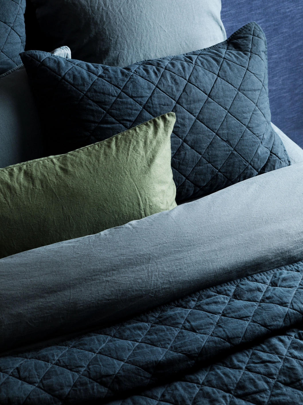
Vintage Washed Linen Steel Blue Coverlet
Picture Source: Adairs
Wanderlust Linen Cushion
Picture Source: Hawtrey
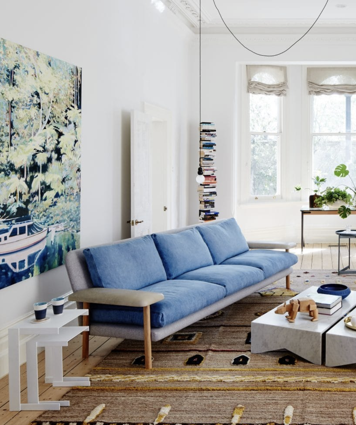
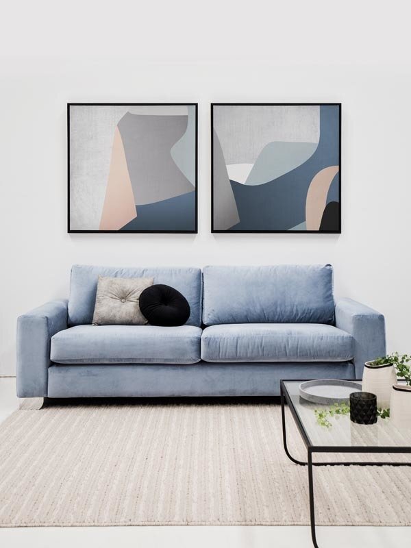
Rufus Sofa
Picture Source: Jardan Furniture
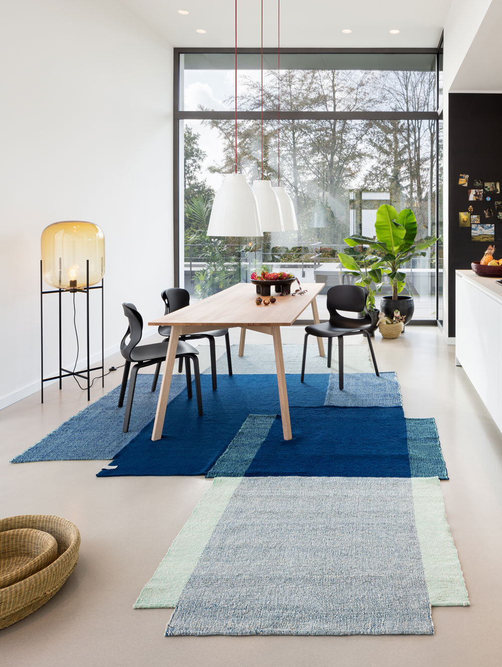
Nobsa Blue / Mint Rug
Picture Source: Halcyon Lake
Vesl Basin Square - Powder Blue
Picture Source: Nood & Co
Seaspray Vase - Mist by Papaya
Picture Source: Papaya
Rottnest Island - The Heart of Rottnest Wallpaper
Picture Source: Scandinavian Wallpaper & Decor
Soho Quilt
Picture Source: L&M Home
Facade Art Print
Picture Source: Urban Road
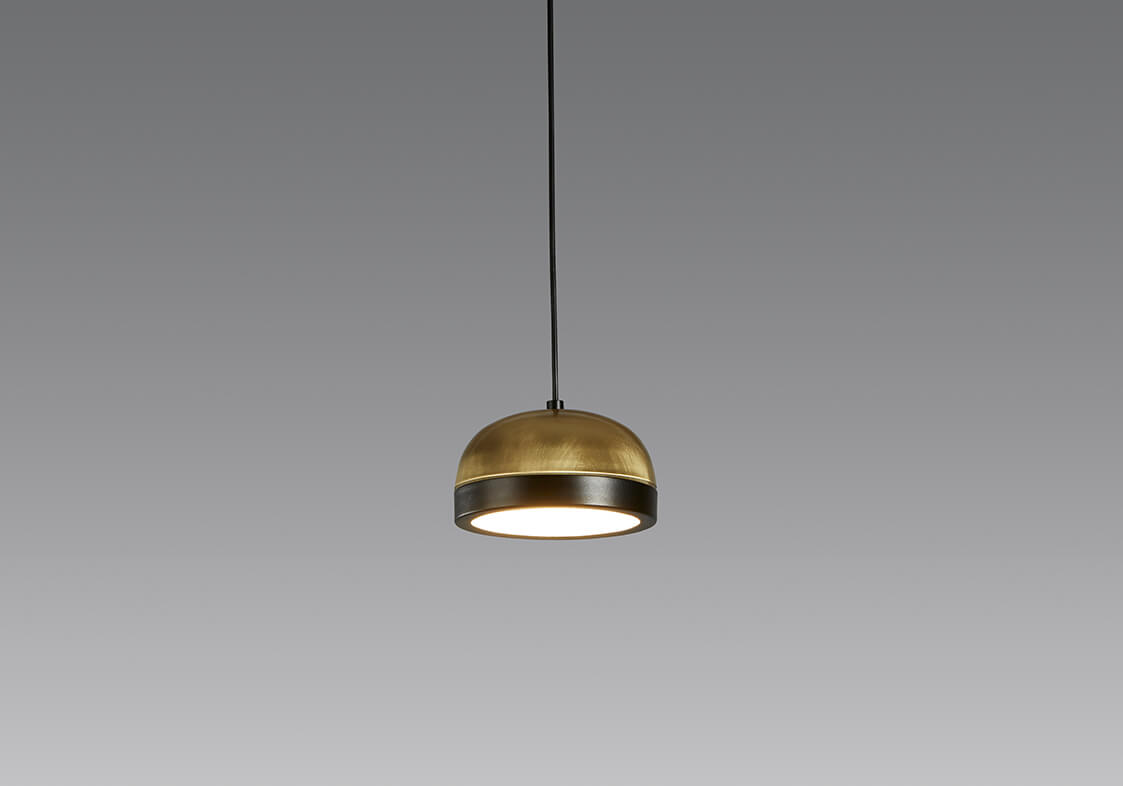
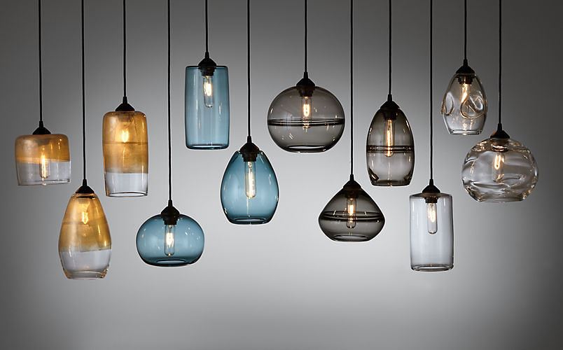
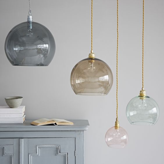
TU Pendants
Picture Source: Lights Lights Lights
Shoreline Vessel
Picture Source: Jardan
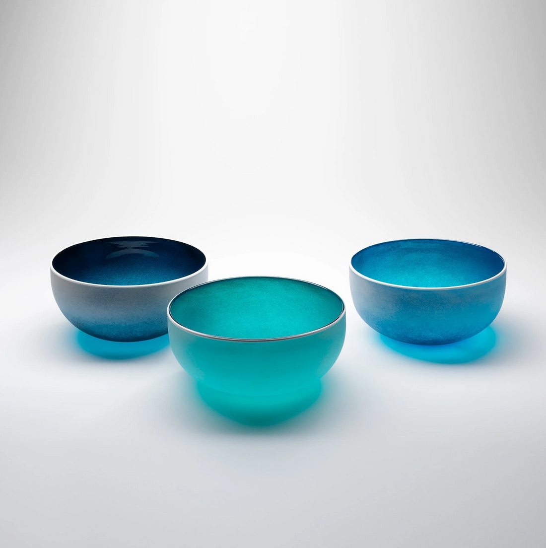
Beach Serving Bowl
Picture Source: Contemporary Co.
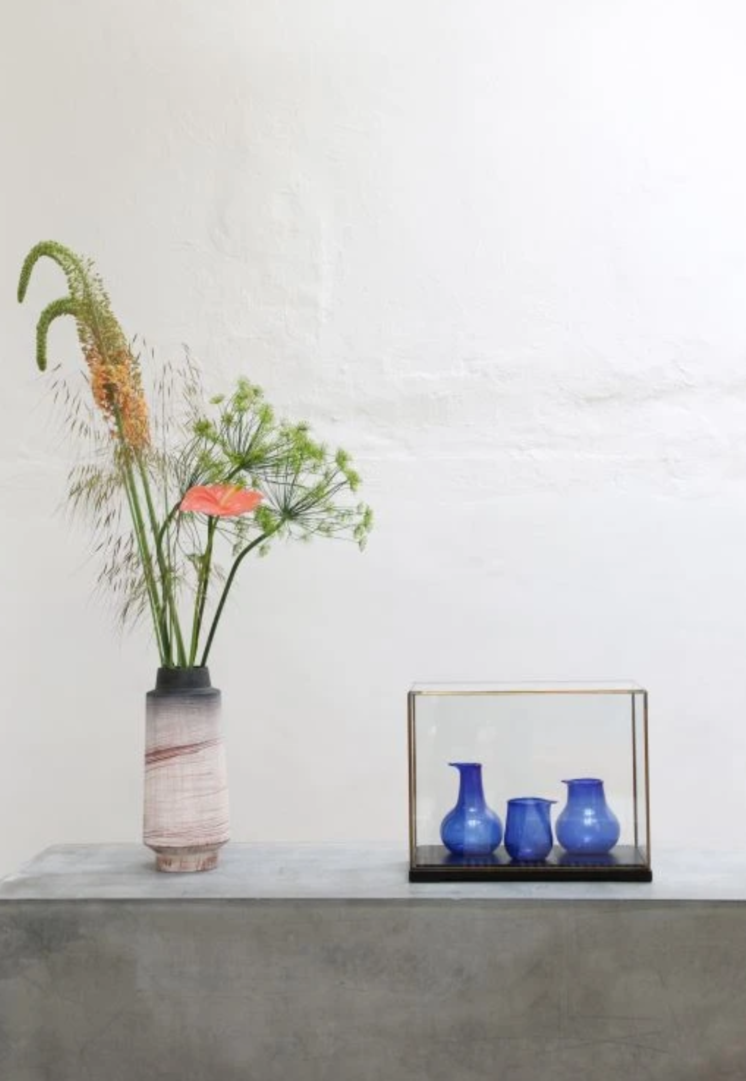
Recycled Cobalt Vases
Picture Source: House of Orange
Back to Black
Thought you knew everything about the all black design trend? Think again!
Long gone are the days of white internals and runner and chrome hardware and accessories. The all black design trend is here to stay… and the obsession has only just begun…
So, you may already know that the team at Prince Design have a slight obsession with black! Look, it’s just so sexy that we can’t seem to fault it. It can instantly transform a space into one that oozes sophistication. Just when we thought we had seen it all with black, our love reached a whole new level when we were introduced to the new internal range of cabinet hardware that is being released this season.
ALL BLACK, EVERYWHERE!
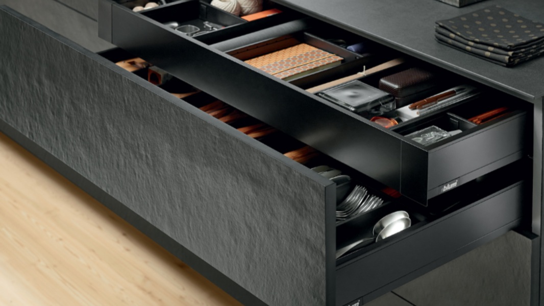
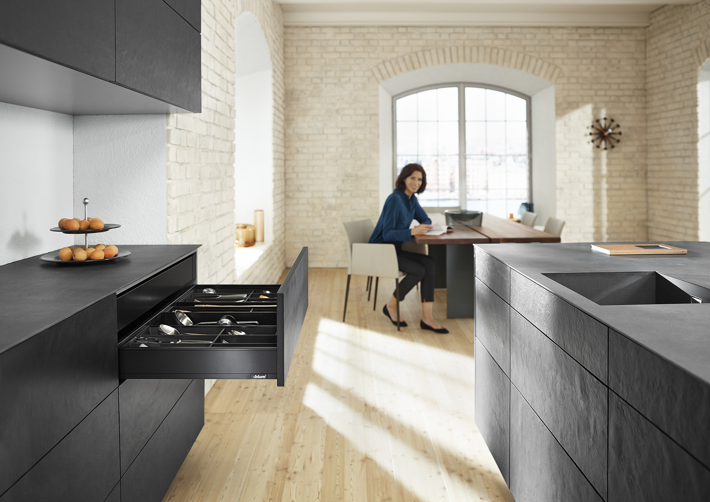
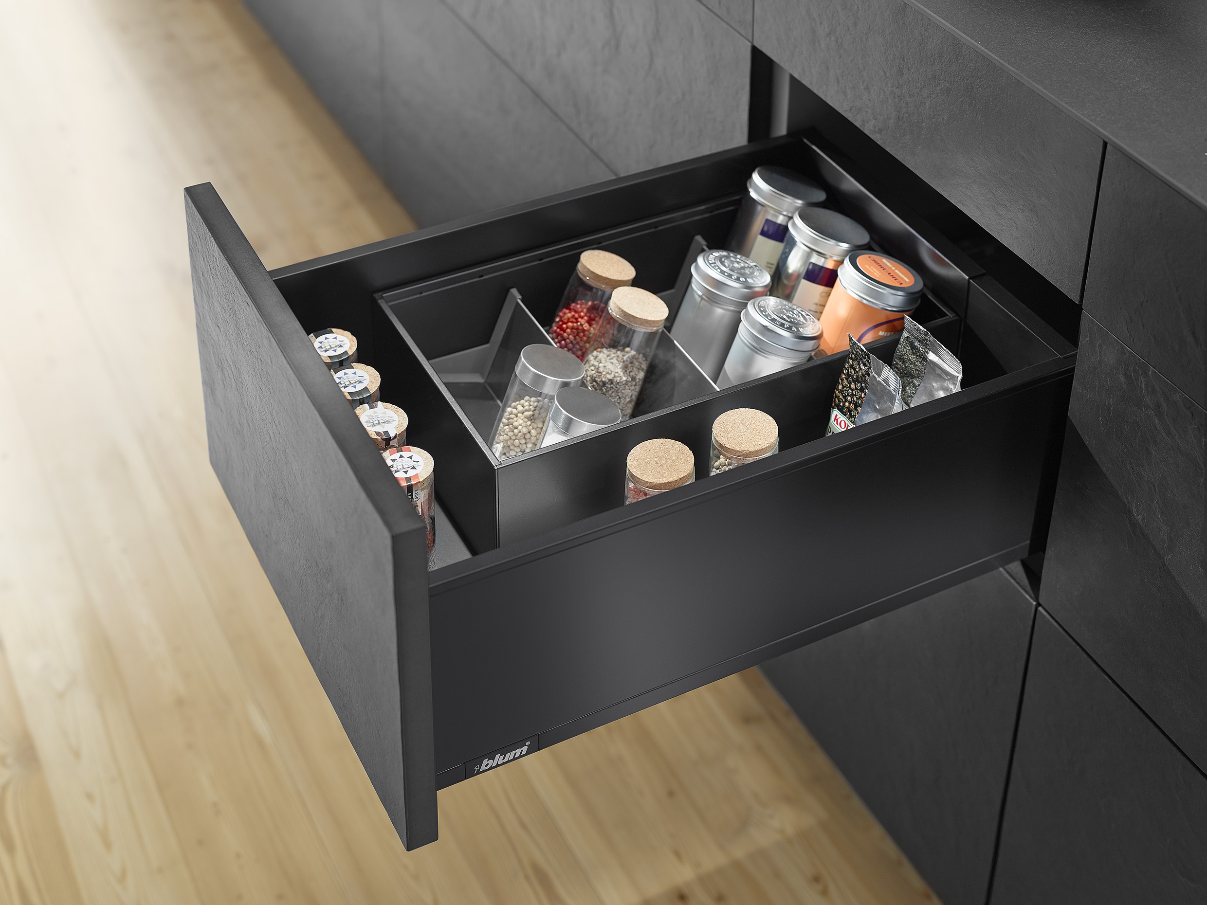
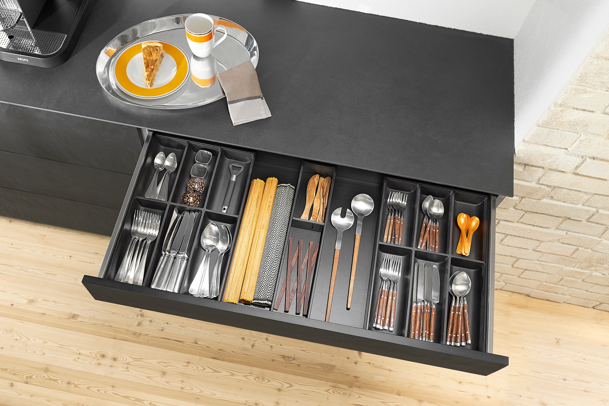
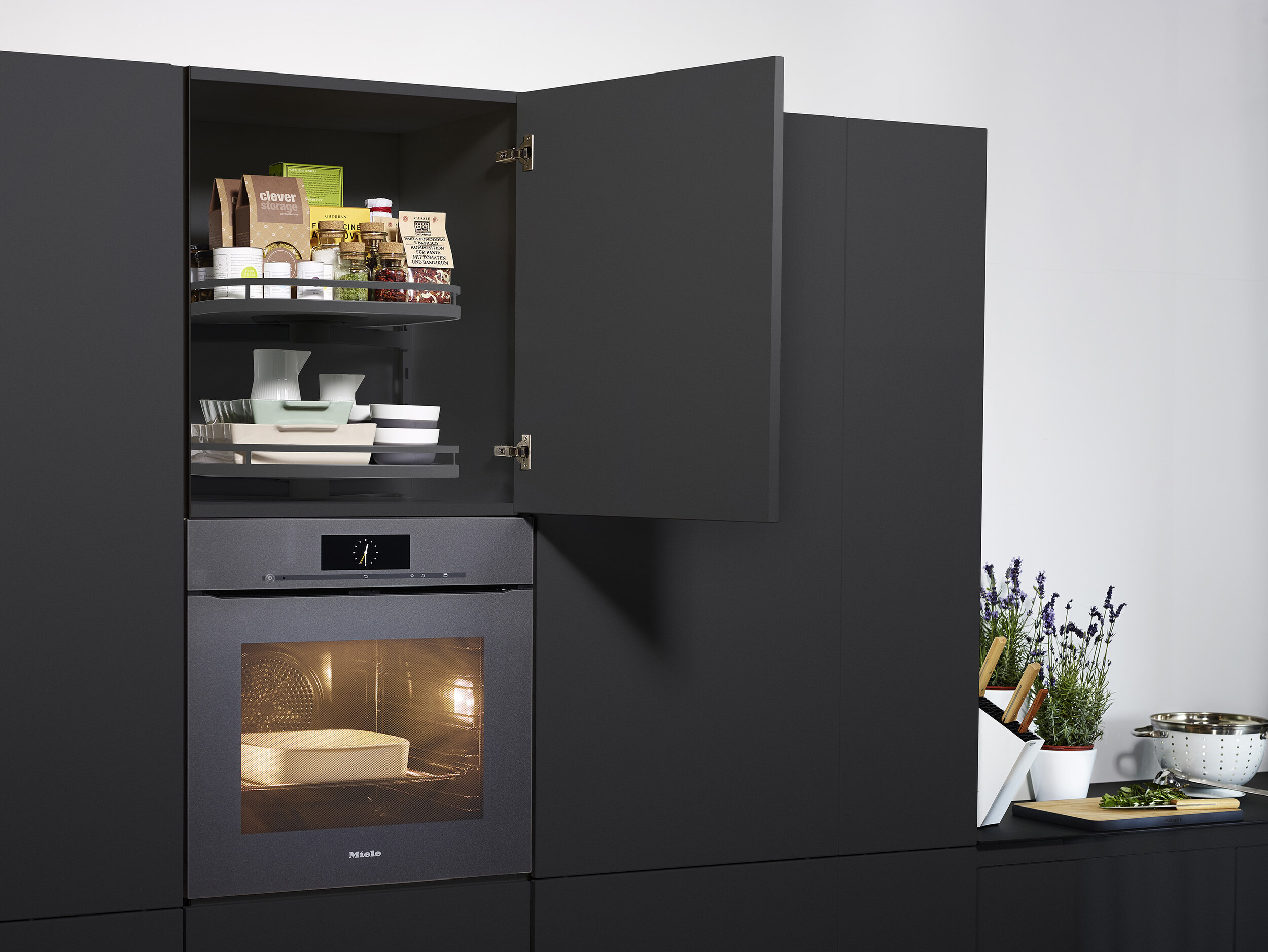
Gone are the days of opening up a drawer and seeing the chrome or white runners sliding your drawer along. We are super excited to let you know that now you can streamline the finished look by opting for coloured runners and sides instead. Now you can match your sleek black cupboard doors to all the fronts and internals, creating a sophisticated and seamless look. Design is all in the details, we say! Blum’s LEGRABOX range of inner pull-outs come in a variety of different heights and colours making it easy to customise for your unique stye. Our favourite in the office is the sleek matt black in Terra, which is pictured in the images below.
Blum has then outdone themselves again by creating a line of internal dividers and drawer accessories called AMBIA-LINE for LEGRABOX, that complement the original LEGRABOX range. Achieving that seamless style has never been so easy!
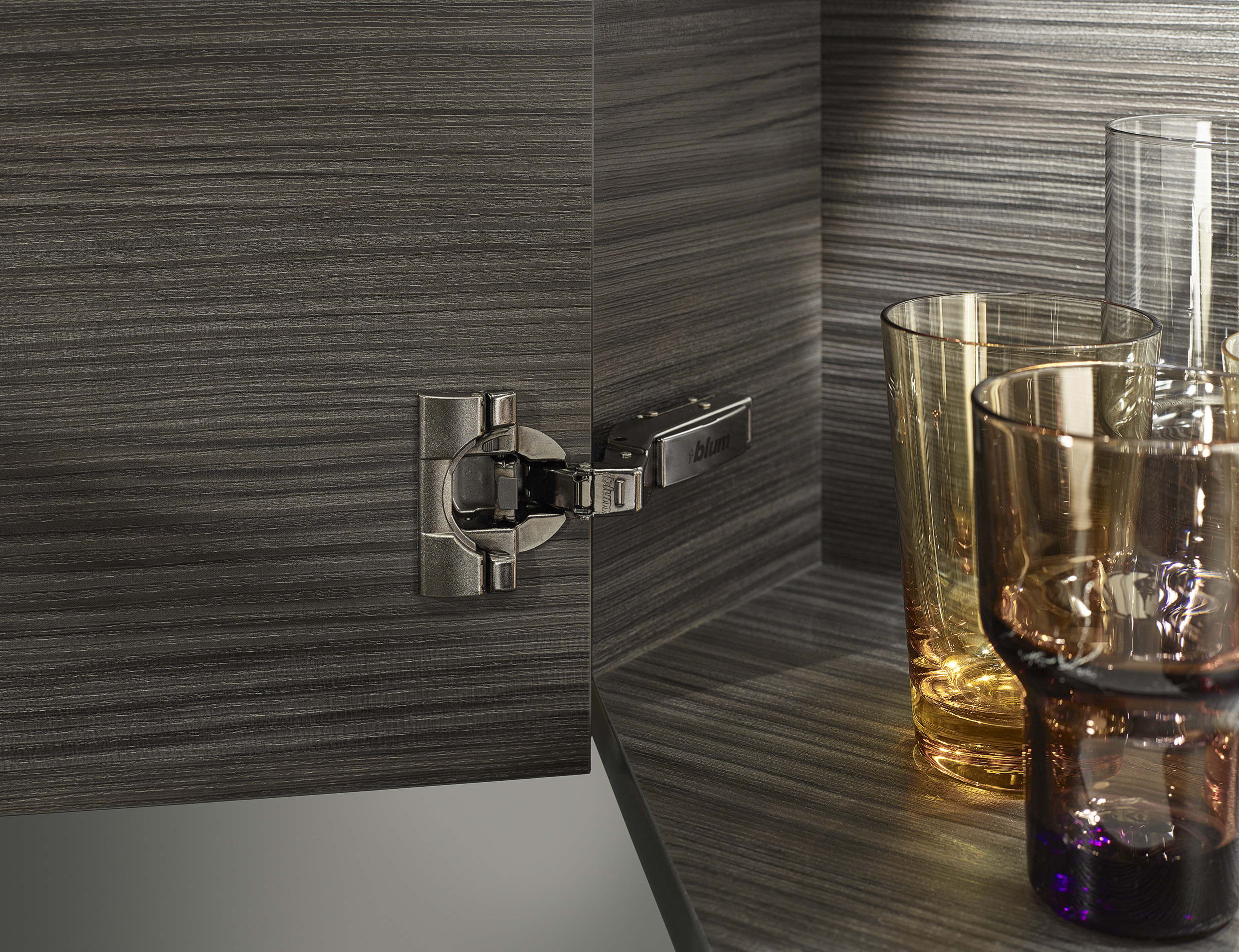
The commitment then continues by Blum, as they make design history! Never before has a range of coloured hinges been developed. These hinges can be applied to your cupboards, ensuring that sexy, sleek black look flows throughout.
“We recommend pairing Blum’s CLIP top BLUMOTION in onyx black to the interior of your cupboards to achieve that designer look and feel“
Picture source: Blum
ALTERNATIVES TO BLACK?
ANTHRACITE
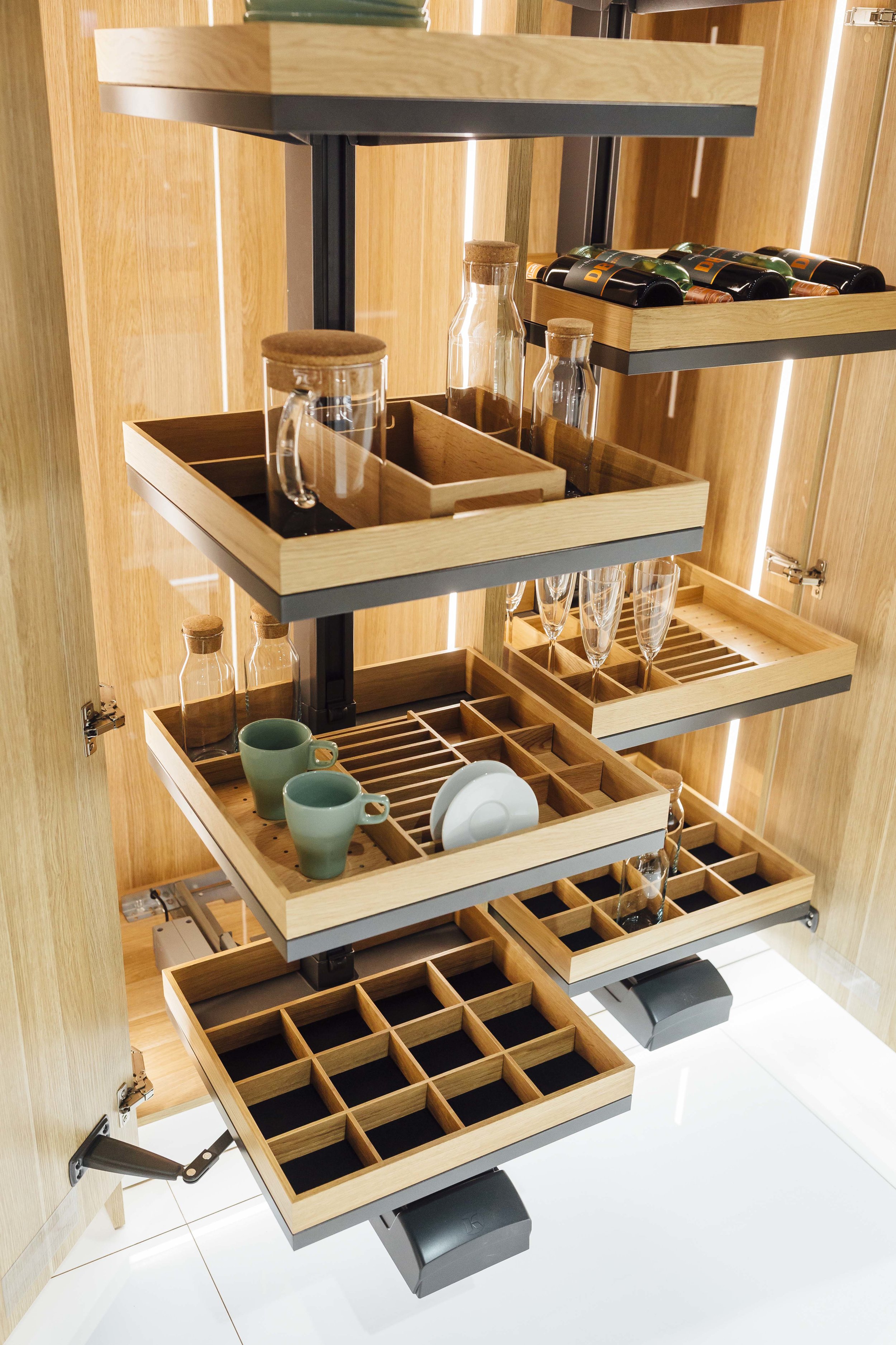
We understand everyone may not be as enthusiastic about black as we are because let’s face it, we might be borderline obsessed! So, we are happy to introduce some gorgeous alternatives instead. Hafele’s new ‘Anthracite is the New Black’ range presents something new and just as exciting! Anthracite is a form of coal that has a semi-metallic dark grey appearance. The new range by Hafele presents the harmony of “wood and metal that is both on trend and timeless”. Sprucing up your storage in a way that has never been done before. Below are our favourite, must have items! Who knew that storage could be so exciting!
Picture source: Hafele
Picture source: Hafele
Picture source: Hafele
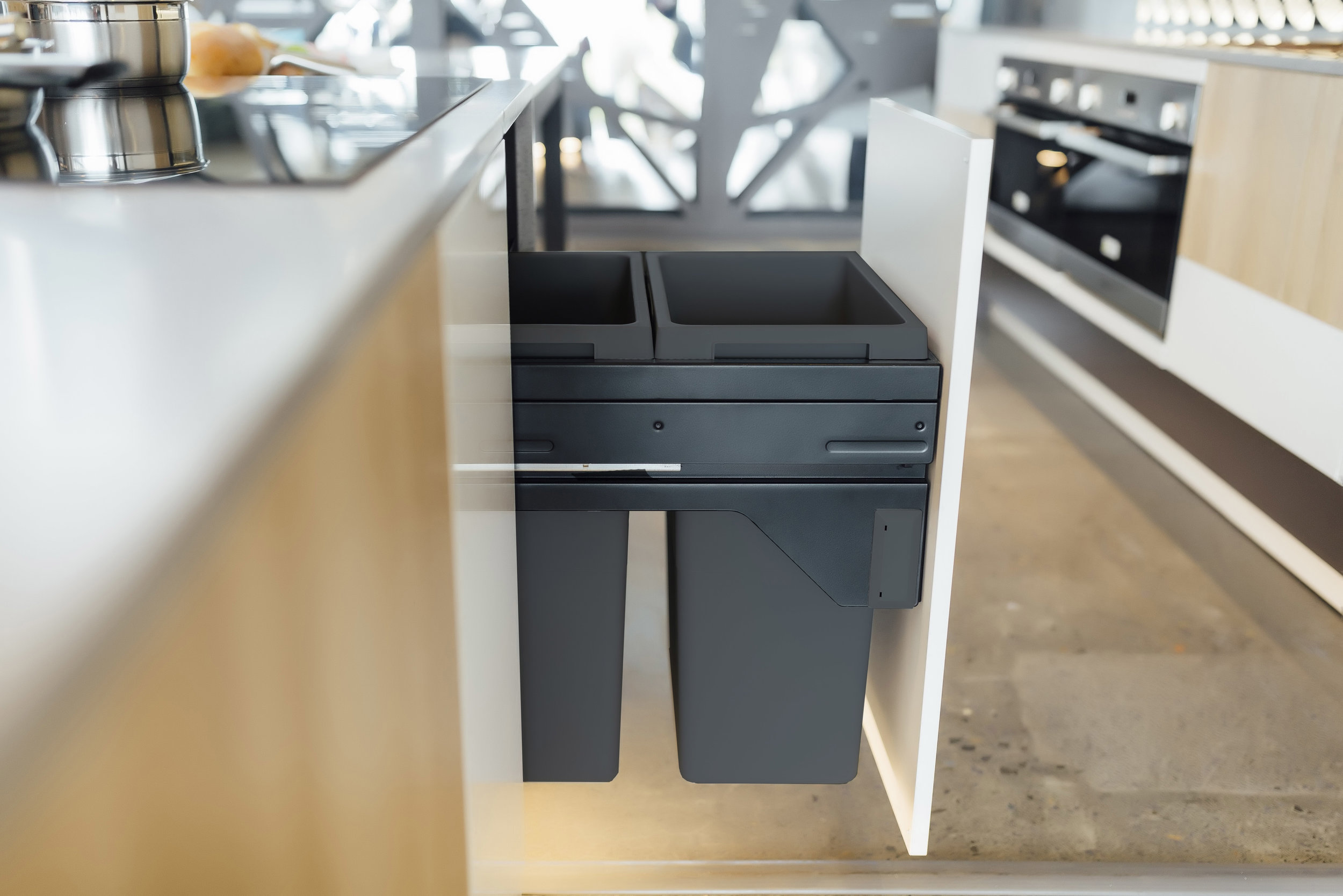
“Tell me more”, you’re saying, “Where else can I apply this design trend?” Luckily, Hafele have thought about almost every detail. Their EURO CARGO independent storage bins are now available in anthracite. Just because bins are a place to put the trash doesn’t mean they have to look any less spectacular! Everything from the interior hardware to the exterior coat of the bins have all been developed in anthracite. Allowing you to continue the look throughout your kitchen.
ORION GREY
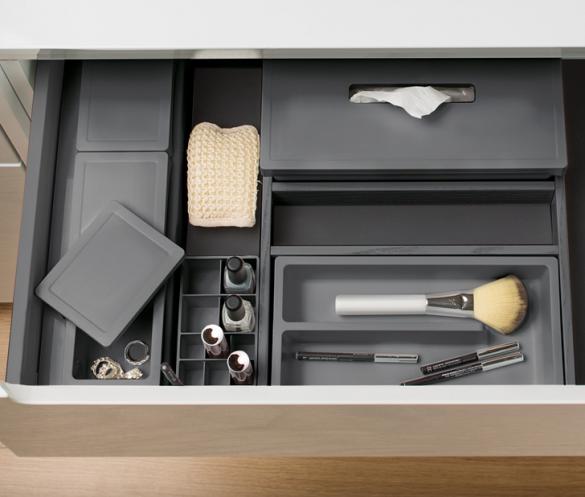
Another company joining in on the groundbreaking designs is Gollinucci. Their range of drawer dividers called ONDA, now come in an orion grey. The dividers come in a range of shape and sizes, allowing you to easily customise your drawers to fit in all of your items. We love the thought of waking up to this level of sleek storage. It makes it a tiny bit easier to get up in the mornings when you know you have this waiting for you in your bathroom!
Picture source: Gollinucci
Picture source: Gollinucci
BLACK WITH A TWIST!
Picture source: Hafele
If you’re someone who likes a black accent, then we’ve got you covered! As Hafele mentioned, the combination of timber and anthracite is nothing short of show stopping. Let Hafele be your inspo goals, as you use their combination of an anthracite base with timber internal dividers, as your reference. Creating a high end design style with your own unique twist!
Love these products? Visit Lincoln Sentry to explore the range of cabinet hardware in black and anthracite. You’ll be well on your way to creating a sophisticated, seamless look and we can’t wait to see what you come up with!
Denfair 2019
A weekend in Melbourne – lots of shopping, all the food you can eat, bars… and of course, Denfair! My favourite design event of the year and who doesn’t love a good excuse to jet off over east for a week!?
An inside look at Melbourne’s hottest design event
A weekend in Melbourne – lots of shopping, all the food you can eat, bars… and of course, Denfair! My favourite design event of the year and who doesn’t love a good excuse to jet off over east for a week!?
Denfair is a design event that is held annually in Melbourne and Sydney. It’s a chance for hundreds of local and international brands to come together and connect through their passion for design. So naturally, I fit right in, and I am so excited to share with you some design gems that I found!
All About Colour!
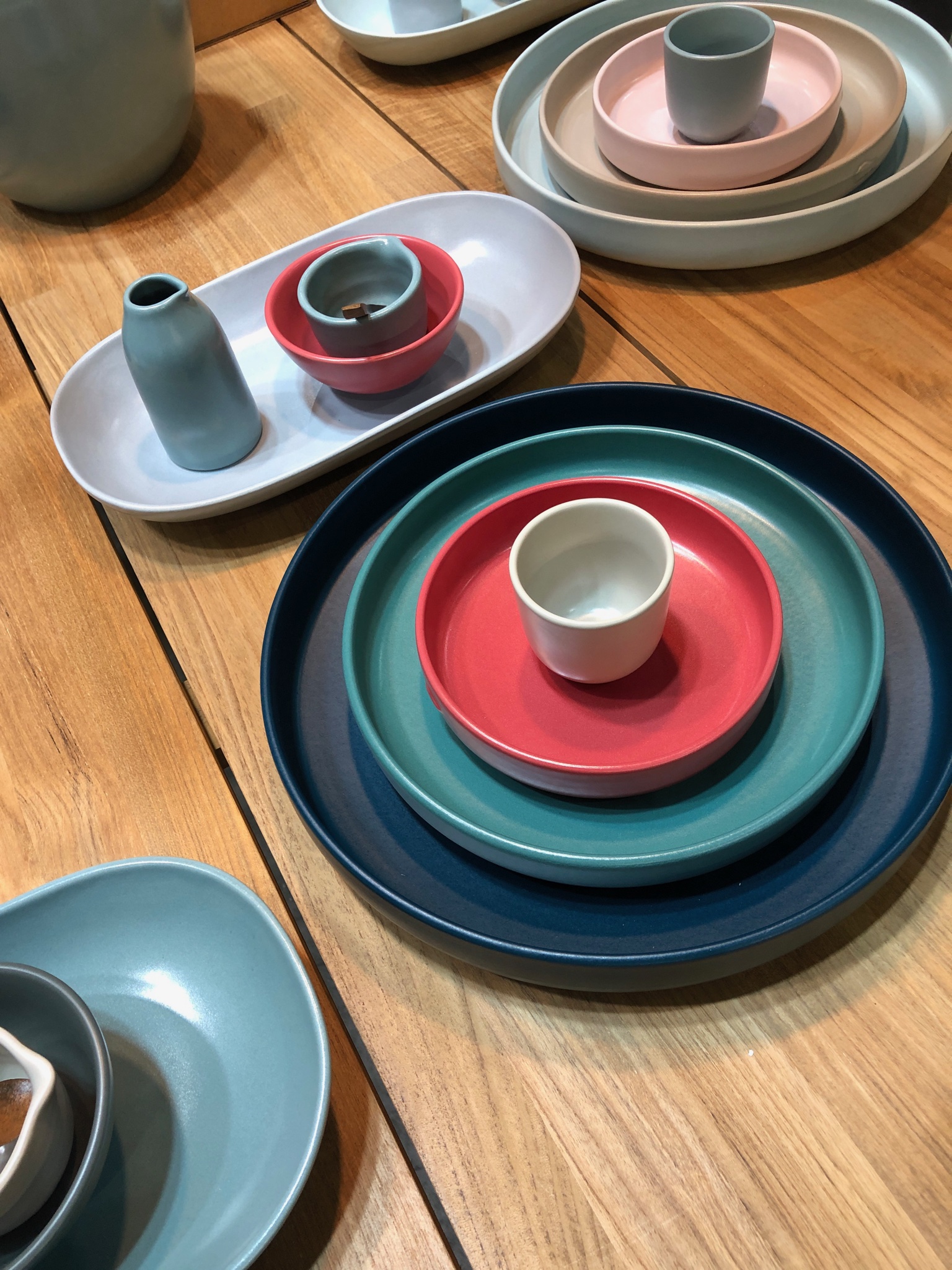
This year was all about colour! While there have been pops of colour in previous years, this year it was everywhere! We’re talking soft furnishing, homewares, ceramics, glass…everywhere I looked…COLOUR. While Grey is still popular, the total saturation in every shade of grey, is well and truly over. Hello brave new world!
These are just some of the stunning coloured ceramics and glass from Bison Home
Earth Tones & Soft Edges
We have been talking a bit about this colour trend is some of our previous blogs...and it was absolutely everywhere! Terracotta, olive and forest greens, ochre and mustard yellows, sienna reds. These beautiful autumn tones paired with the softer shapes created a relaxed yet very contemporary feel.
I was absolutely in love with this entire stand by Domo. The Wings Bed and Vuelta Armchair chair, designed by Jaime Hayon were only some of the gorgeous pieces.
Have a look at our blog from the beginning of the year to find out more about the colour schemes that are trending in 2019.
Organic Materials
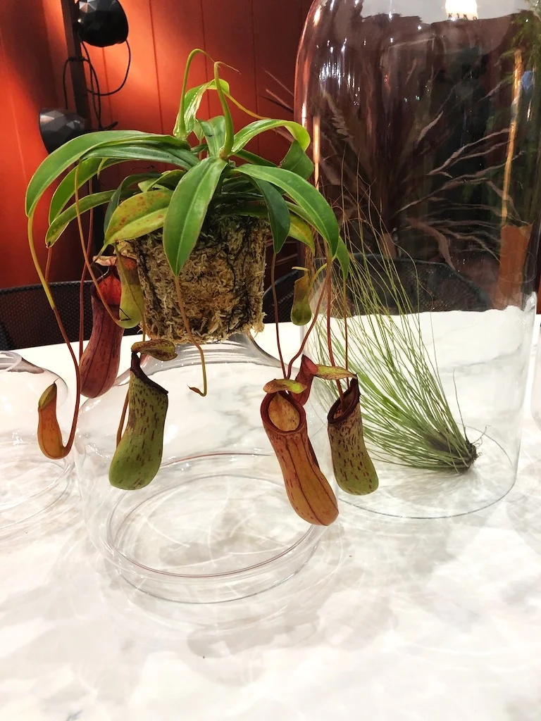
Imperfect is the new perfect! Slick, clean-cut furniture is no longer! The interior design world is heading back to its organic roots using raw, earthy materials and designs. Statement pieces are incorporating plants and real materials to create this look.
Real tapware, real materials! Wood Melbourne, amazing as always, with their solid timber, concrete, brass, marble and more tapware and basins!
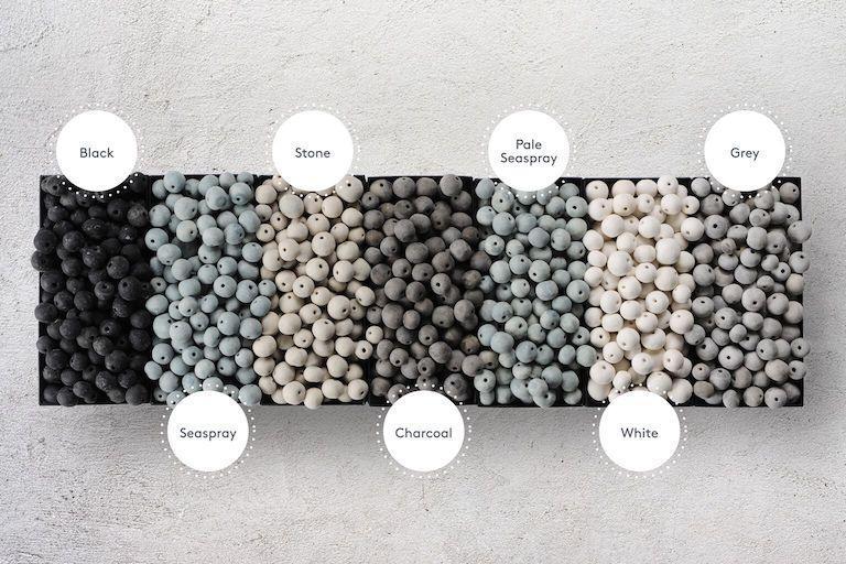
Klaylife had to be one of my favourites from the day. Their unique beaded lighting and décor are hand-made by aids affected women in Kwazulu-Natal, South Africa. Their use of raw clay to create a stunning earthy look is even more special because they are each individually made. No item is exactly the same. Colours ranging from Black, to Stone, to Seaspray, and all the way to White…including the option to ombre!
Oxidised Metal
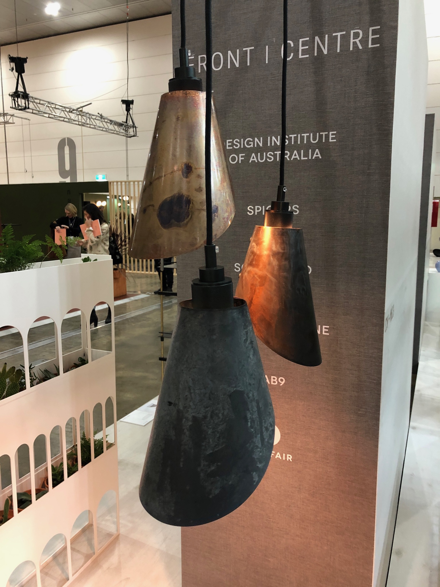
This trend highlights the imperfections of an object. None of us are perfect so why should our furniture be! Our imperfections is what makes us individual and stylish. Instead of throwing away materials we think are outdated designers are now turning them into something new and special. Check out these Too Tone pendants by Kajewski Miller & the stunning Oxydation Table from Domo.
Lighting
Anyone who knows me knows I am absolutely obsessed with unique, beautiful lighting. There were so many favourites from the fair but I’ve managed to narrow it down to my top 3 to show you…
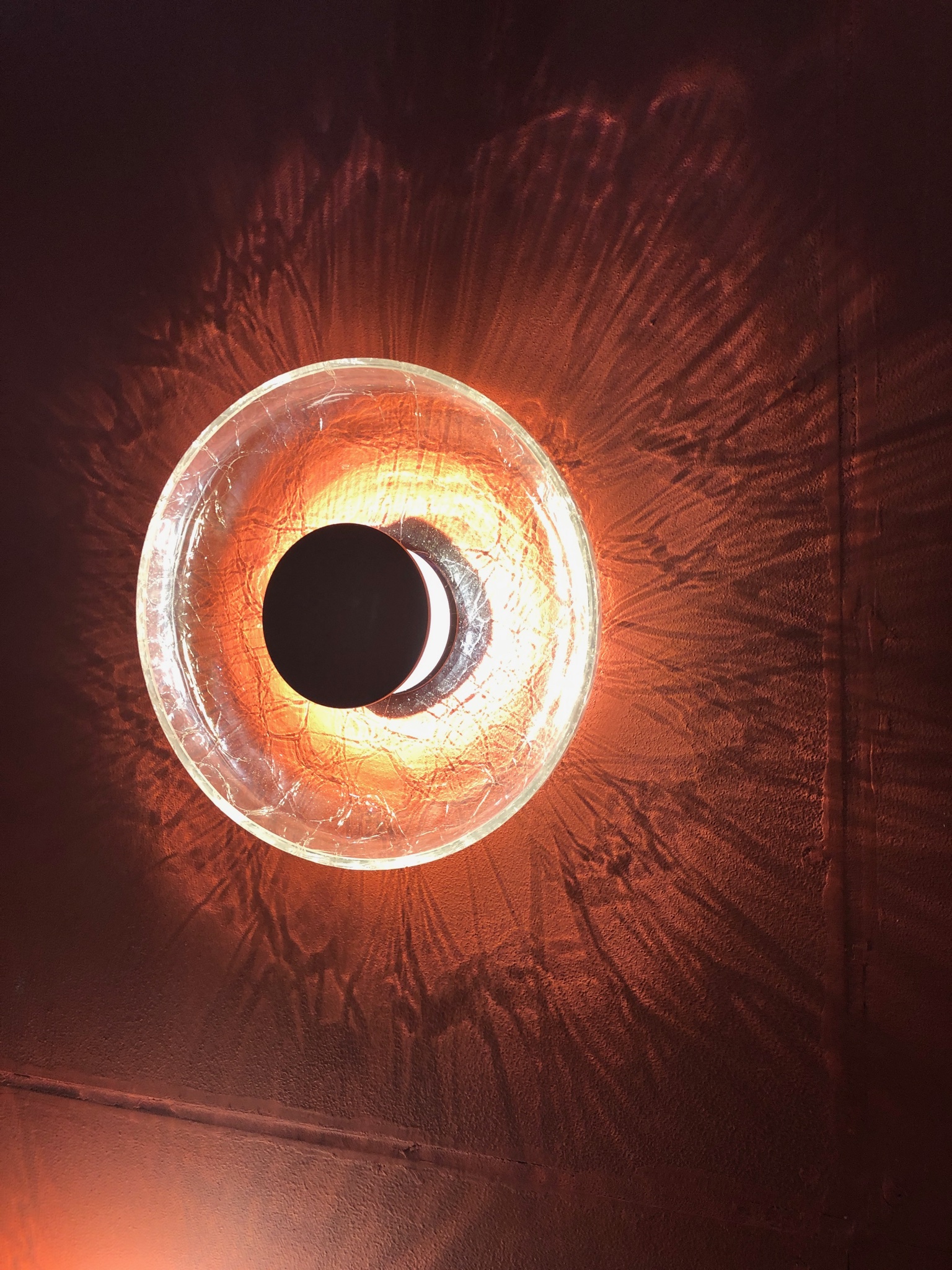
A DesignStudio
This piece had to be one of my favourites of the day! The rawness and imperfect nature of the cracked glass creates a stunning visual on the wall. Visit their website to have a look at some more unique designs.
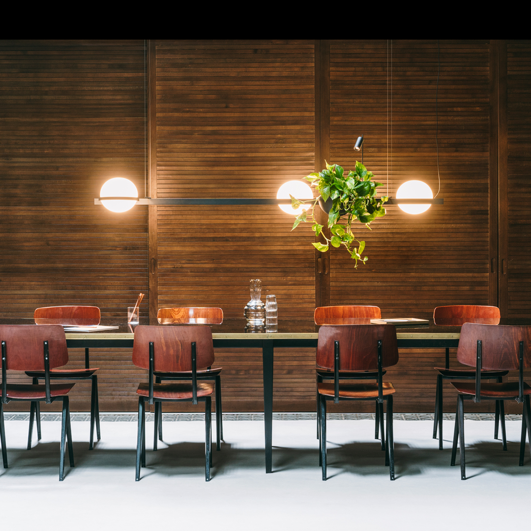
KODA Lighting
KODA Lighting has done a wonderful job at combining lighting with plants in a visually breathtaking way. Again perfectly aligning with the new trend of going back to organic, earthy roots. A simple but extremely clever design and one of many you can look at on their website.
Dedon
Dedon is an outdoor company who creates innovative and relaxed settings. ‘The Others’ outdoor lanterns are hand-woven sculptures that are aesthetically pleasing and create a warm light. The results? A relaxed setting where you and your friends can gather to have a cheese and wine night!
Art
Never underestimate the effects of a good piece of art. Some of the art at this year’s event absolutely blew me away!
My absolute favourite were these incredible pieces by Andrew Vukosav as part of his “Longitude Latitude Solitude” image series. These breathtaking photos of the Australian landscape were captured while flying his small plane across the country.
The way he was able to capture the wonders of nature is just simply beautiful. I am obsessed with these pieces – the scale, colours and the simplicity of the design… it all just works perfectly together.
Contact us at info@princedesign.com.au for help on making a purchase!
Fireplaces to Keep You Warm This Winter
Baby it's Cold Outside....
Whether its wood, gas, electric or ethanol, we’ve got the fireplaces to keep you warm this winter.
Baby it's Cold Outside....
Whether its wood, gas, electric or ethanol, we’ve got the fireplaces to keep you warm this winter.
With winter quite literally arriving last week, it’s time to bust out the Uggs and curl up in front of a cozy fire with a good glass of red!
We have been chatting to our good friends at Subiaco Restoration about all things fire, and have some hot (pun intended) tips to share to keep you toasty this winter.
There area quite a few different types of fireplaces out there these days but we we’ll stick to the big 3 being Wood, Gas & Electric for now…..
WOOD
I think we can all agree there is nothing quite like a wood fire. The smell, the heat and the hypnotic flickering flame gives a feeling of comfort, warmth, and relaxation that is fairly incomparable.
Wood fires are not without their shortcomings though.
As beautiful as they are, they are an investment. Not only initially for the purchase, but for the ongoing use. Buying or chopping wood, storing the wood, lighting it, keeping it lit and then cleaning it can be a bit much for even the most ardent fire lover.
Our 2 Favourite Wood Fires
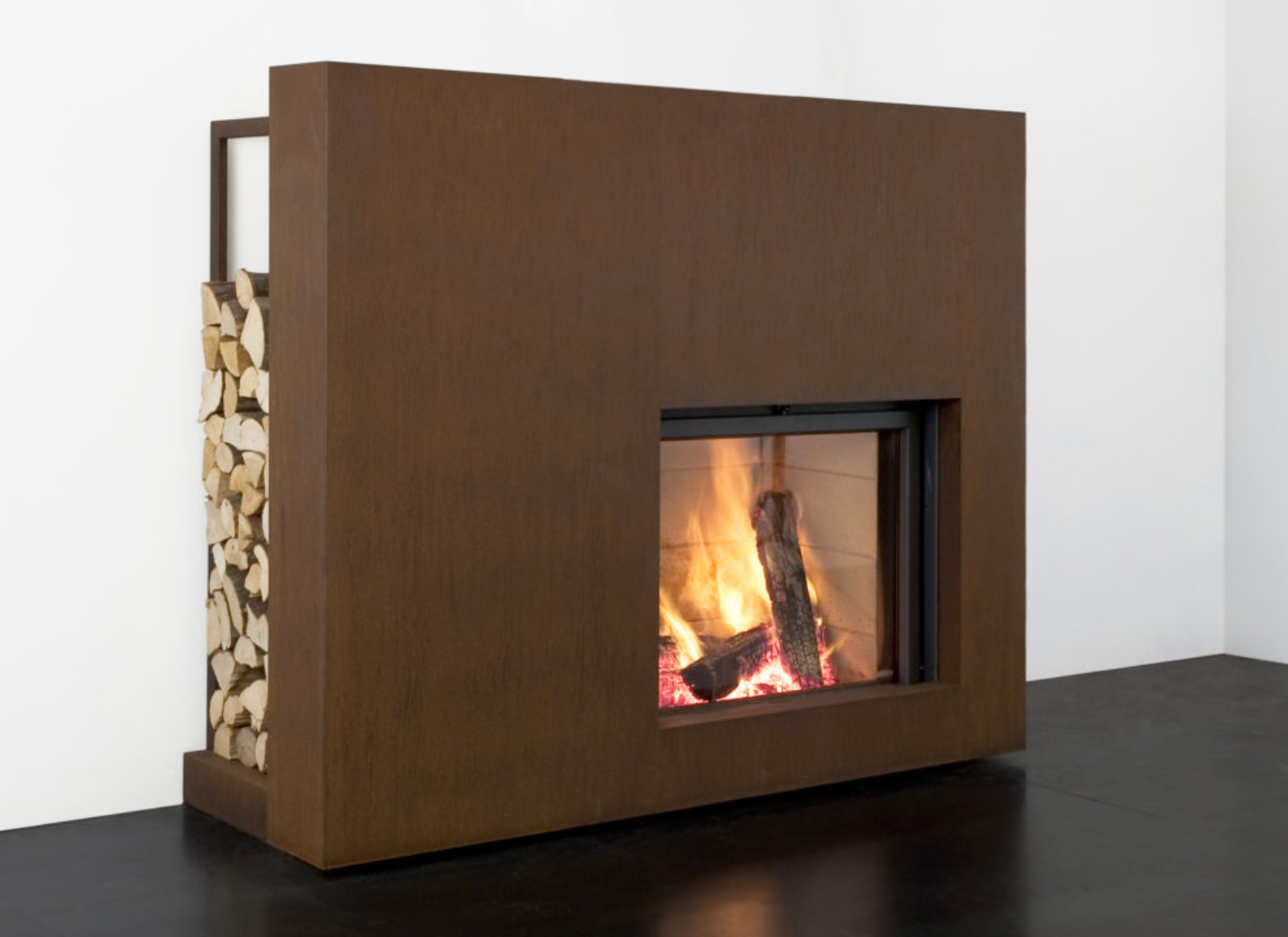
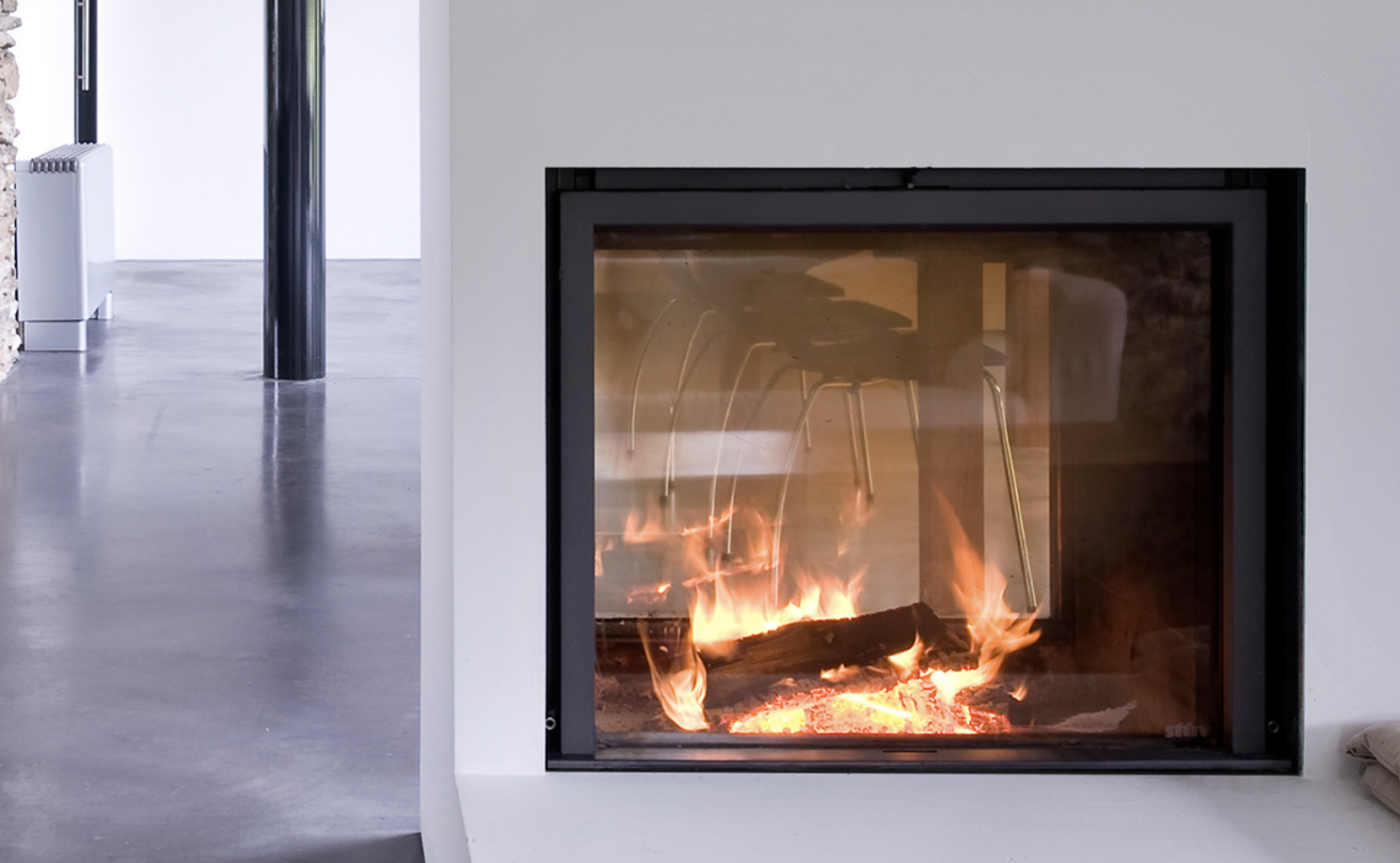
Stûv 21 - Heralding from Belgium, I stumbled across this amazing brand at Denfair a couple of years ago. I love it for its elegant minimalist design. It offers an unimpeded view of the fire with its clever retractable glass door and zero clearance installation. It is also available in a frameless installation or can come with ready to install finishing fascias with built in wood storage!
Gyrofocus - The worlds first suspended fireplace…as epically cool today as it was when it was created in 1968. So cool it was voted “World’s Most Beautiful Object” in the Pulchra Design Competition in Italy in 2009
GAS
Gas fireplaces…the next best thing to a wood one!
With none of the time investment of wood, they are easy to turn on when you get home, generally have a great flame pattern with or without heat (keep this in mind when looking at models as some can be decorative only and have very little heat throw) and usually have thermostat control (depending on the unit).
Meaning they are so, so easy!
Our 2 Favourite GAS Fires
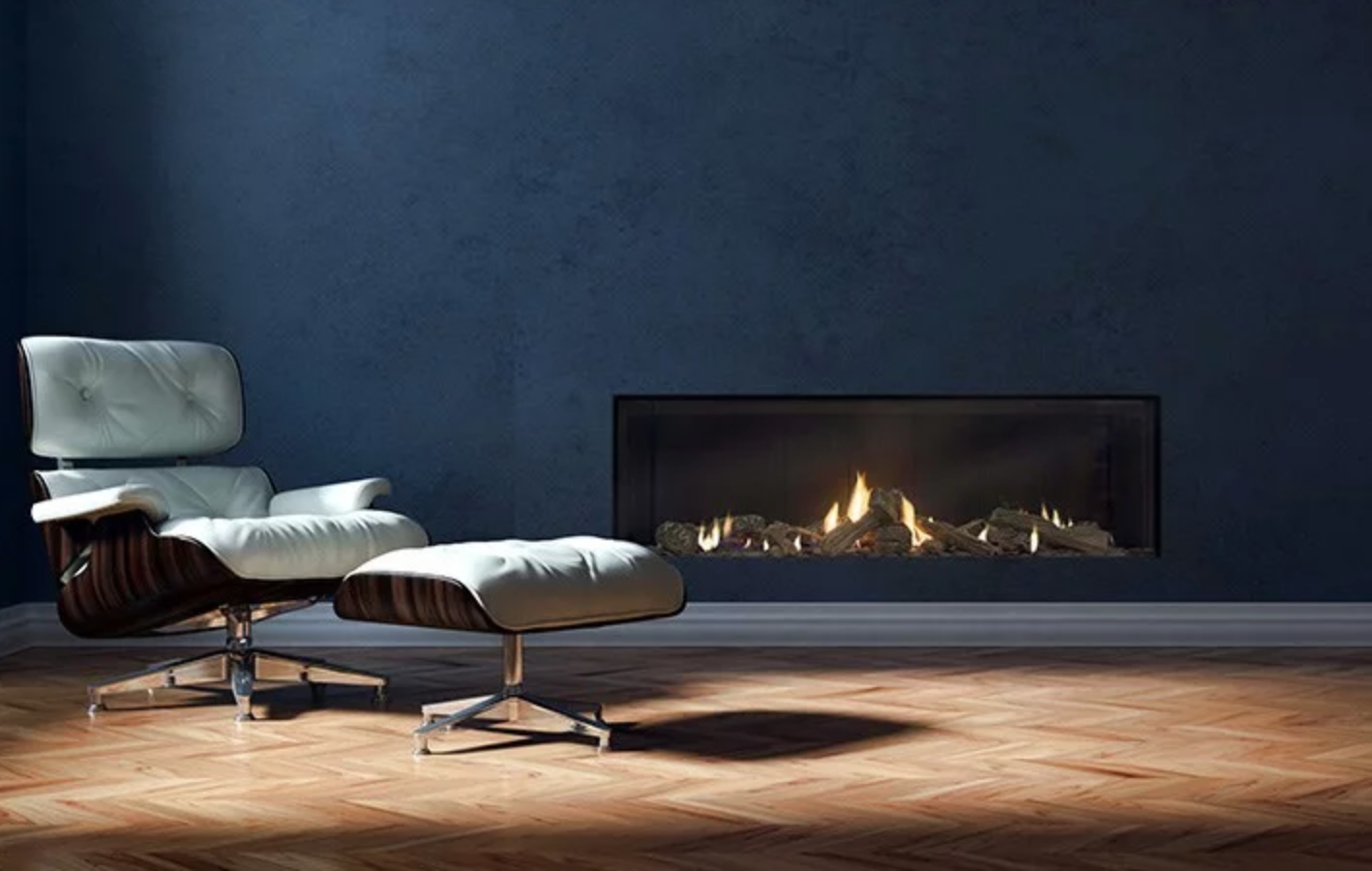
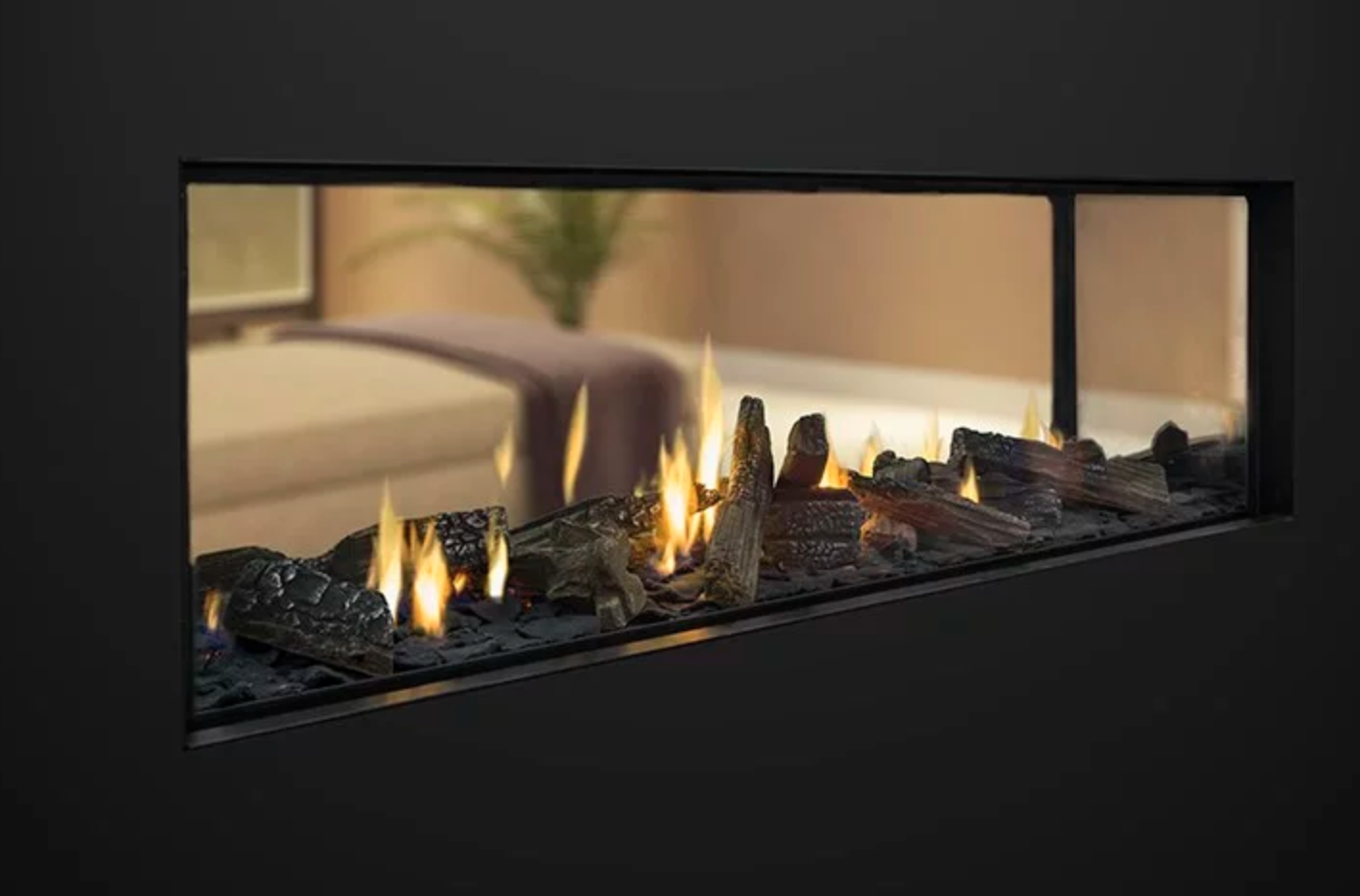
Escea - At 1m or 1.5m wide and available in single and double sided with truely frameless options and a range of fuel bed designs to choose from (driftwood, pebbles, logs etc), these gas fireplaces make a dramatic statement.
Real Flame - With their Landscape model boasting up to a 1.6m wide design which heats up to 150m2….this is the fire for the large open plan homes we all live in today!
ELECTRIC
Electric fireplaces are the perfect solution for existing homes as they require little to no provisions to install. No flue is required…as long as you have power, you are good to go!
Because they very rarely are built in, you can take them with you when you move, or move them around the house as you wish.
Our 2 Favourite ELECTRIC Fires
Dimplex - These are the perfect fires for the lovers of classic styling. Their complete suites are available with a mantle of your choice including marble finishes and full grates of life-size hardwood-cast logs.
Gazco - Their “hang on the wall” fires are super easy to install and offer a contemporary landscape look without the fuss cutting into walls.
WHAT’S HOT NOW??
Landscape fires are still, oh so popular, and always look great.
TV’s over fireplaces…not any more! I prefer the TV off to the side for a cleaner look and to make the gorgeous fire the focal point, not the TV.
The second point leads me to this trend alert - Tall or large square fires are becoming more and more popular. I absolutely love the scale of the Stuv wood fires…hopefully there will be a gas equivalent replicating this look available soon.
A Complete Guide to Everything Wallpapers
We’ve had the pleasure of collaborating with the amazing team over at Scandinavian Wallpaper Decor for quite some time, and they’ve been generous enough to share some of their expertise and trade secrets about everything wallpapers. We’re going to take you through some of the biggest trends in wallpapers, as well as provide some hints and ideas on where to wallpaper, how to select the perfect wallpaper for its application and tips for installation day!
We’ve had the pleasure of collaborating with the amazing team over at Scandinavian Wallpaper Decor for quite some time, and they’ve been generous enough to share some of their expertise and trade secrets about everything wallpapers. We’re going to take you through some of the biggest trends in wallpapers, as well as provide some hints and ideas on where to wallpaper, how to select the perfect wallpaper for its application and tips for installation day!
Trend Alert
Luscious Greenery
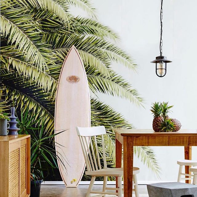
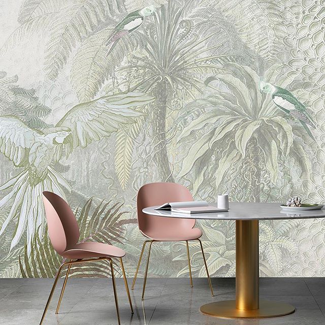
This trend goes beyond just wallpapers - this year we are seeing people embrace the natural environment and envelope themselves with luscious plants, gorgeous floral prints and tropical designs. This trend is about surrounding yourself with beautiful leafy interiors. This trend has also brought with it an increasing popularity for gorgeous natural grass cloth and hemp wallpapers.
Ombre Relaxation
Mural ombre printed wallpapers are making a sweeping statement across moody spaces. The intention of these spaces is to create an aura of relaxation, whilst keeping elements of nature ever-present. We’re seeing this trend being particularly popular in bedrooms and living rooms.
The feel of these spaces is to be relaxed and tactile, yet with subtle references to nature. This trend appeals to the minimalist, keeping with either a monochromatic or very simple colour palette.
European Toile
Gorgeous toile wallcoverings have also been a particularly popular choice this year. These on-trend toile wallpapers have been inspired by designs from both Paris and Sweden, with many different wallpaper designers and suppliers adding their own flare.
Timeless Millennial Pink
The belief that pink is simply a trend, is no longer the case. All hues of pink are now being widely recognised as a timeless colour. This means that the stunning millennial pink trend is here to stay!
Popular pink wallpaper designs are being used to reflect instances where pink is represented in the natural environment. Scandinavian Wallpaper & Decor have been at the forefront of embracing natural pinks, as seen in their recent Rottnest Island Collection - a beautiful collaboration with artist Jody D’Arcy.
Classic Nordic Hues
The widely popular Scandinavian style is continuing strong into this year. However, we are seeing a minor shift in Scandinavian colour trends, where palettes are being purposefully created around the natural environment. From aqua blue, to black soil, to oats yellow, leafy green and even snow white, we’re seeing almost all Scandinavian colour palettes are being inspired by the natural environment.
Where to Wallpaper
Bedrooms
When wallpapering a bedroom, many seem to default for the ‘safe’ option and opt to wallpaper only behind their beds. We invite you to step out of your comfort zone and think outside of the square! Instead of wallpapering behind your bed, why not pick another wall that allows you to appreciate your beautiful wallpaper when you’re spending time in your bed? Or if you really wanted to stick to the classic behind-the-bed placement, why not consider wallpapering an adjacent wall too, to really create an impactful effect?
Miscellaneous Surfaces
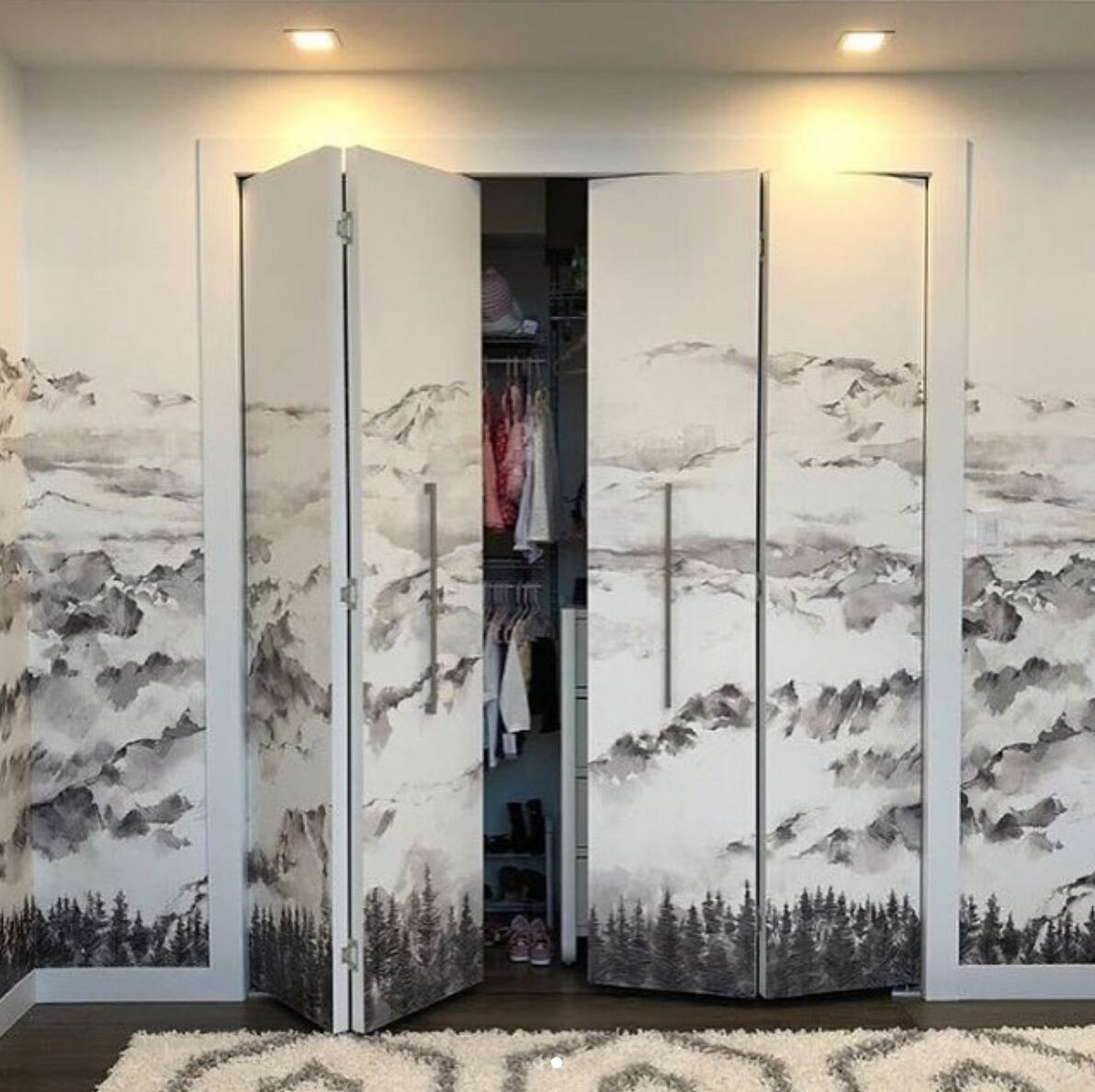
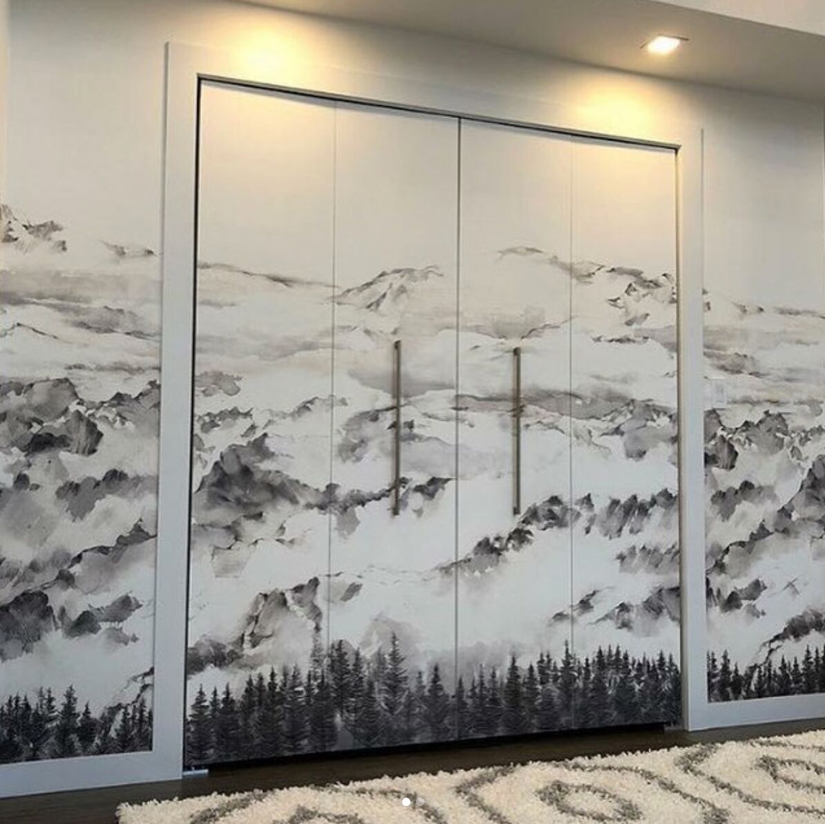
Despite what you think you may know about wallpapers, they aren’t just for walls! Wallpapers can be applied to many surfaces, meaning you aren’t limited to creating a simple ‘feature wall’. For example, if you have glass walls or mirror wardrobe doors, these can easily be covered with a gorgeous mural wallpaper piece. However, please note that when tackling ‘non-wall’ surfaces, it is absolutely crucial that the correct wallpaper type and specific glue is used, so be sure to get in contact with a wallpaper specialist before embarking on a DIY project.
Ceilings
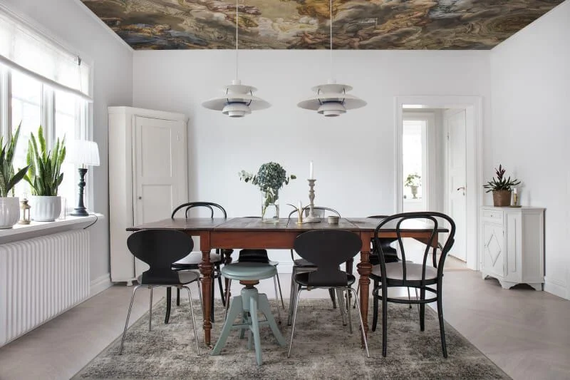
Ceiling wallpaper is back! More and more people are jumping at the opportunity to create a stunning and unique feature out of a sparse and unused space. We’ve been seeing designs and interior architects alike wallpapering ceilings in both bedrooms and in living areas, with amazing results.
The ‘Odd’ Walls
Take a step back from your space and identify any oddly shaped walls or awkward spaces. Adding wallpaper to these areas, can actually make a huge difference to the feel of the entire room. What’s more, is that wallpapering small areas is quite inexpensive, especially when considering it’s proportionate impact on the space. You have the opportunity to repeat a wallpaper that has been used elsewhere - to ‘tie’ a space together’ - or be a little adventurous and select something entirely unique!
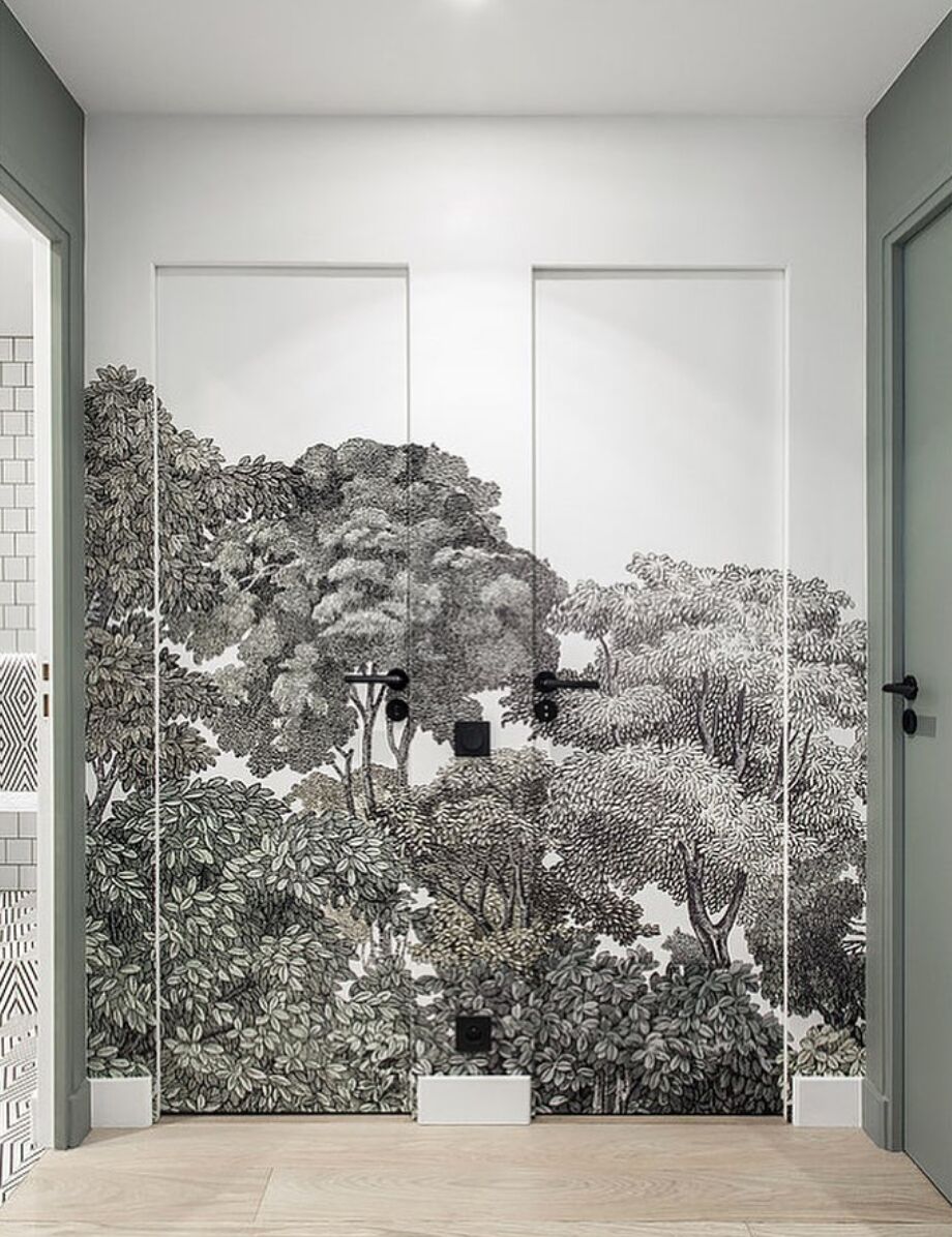
In cases where the ‘odd’ wall has been disrupted by many doors, perhaps consider wallpapering overing the disruptor. This can allow the doors to somewhat ‘disappear’ into the wall, and become part of a stunning feature.
Correct Wallpaper Application
Before getting caught up the excitement of choosing gorgeous colours and exciting prints, you need to take a step back and first select the correct type of wallpaper for the intended placement. It is absolutely imperative that you choose the correct wallpaper material, otherwise you’ll soon find yourself having to replace your beautiful new wallpaper.
Non-Woven Wallpapers
Nowadays, non-woven wallpapers and murals are commonly used in wet areas, such as bathrooms and powder rooms. These wallcoverings are made from a mix of natural fibres, which does allow them to breath, but also makes them not suited to being directly in contact with water, for example, in a shower. Scandinavian Wallpaper & Decor recommends a mould resistant glue, which can be easily supplied by one of their trusted recommended installers.
Most of Scandinavian Wallpaper & Decor’s range of wallpapers are printed on a premium non-woven wallpaper, meaning that they are also well suited to high-traffic areas. This makes the wallpapers perfect for almost any application, from living rooms, to hallways, to bedrooms, and even commercial spaces too. When selecting a non-woven wallpaper, always question the supplier on the sustainability of the wallpaper before you purchase, as there is varying quality across the market.
Vinyl Wallcoverings
In cases where you need a tad more durability than a premium non-woven wallpaper, vinyl coverings are the perfect solution. Vinyl wallpapers are completely washable, making them great for wet areas like bathrooms, kitchens and laundries. It is also a great option if you have messy pets or young children!
Installation Best Practices
Scandinavian Wallpaper & Decor have been kind enough to share their suggestions on best practices when installing wallpaper! Let’s explore some of their top tips.
1. Consider a Professional Installer
Depending on your selections and quantity of rolls needed, wallpaper can be quite an expensive investment. For this reason, it’s always best to go with a professional installer, to ensure a perfect finish. However, if you are committed to the DIY route, all of Scandinavian Wallpaper & Decor’s residential wallcoverings are supplied with a non-woven backing, making installation quite a bit easier.
2. Surface Preparation
Before you start applying the wallpaper, you first must ensure that the surface is smooth, clean and dry. It is essential to seal the wall with a primer beforehand too. An unsealed, uneven or dirty surface will make for a less than perfect finish and can even effect the longevity of the wallpaper too.
3. Order the Perfect Amount of Wallpaper
To ensure that you order the perfect amount of wallpaper, measure the total width and height of your wall, including any doors or windows. It may be surprising to some, but doors and windows very rarely lead to excess wallpaper.
4. Consider Adjoining Walls
When ordering your wallpaper, be sure to let your wallpaper supplier know of any adjoining walls. This is because adjoining walls require consideration for matching colour batches or pattern repeats, so it likely will impact the ordering process from the supplier’s end.
5. Be Mindful of Walls with Different Heights
If you’re looking to wallpaper a wall that has different heights, such as a staircase or sloping ceiling, always ensure that you measure the highest and widest points in the wall. This will make certain that you don’t accidentally under-order.
If you’re looking to freshen up a space with new wallcoverings, we’d be delighted to guide you through your selections. Contact our friendly office today to book your first consultation!
We’d also like to say a huge thank you again to our lovely friends over at Scandinavian Wallpaper & Decor, who made this piece possible.
A Huge Perth Property Flip Win: Discover the Claremont Property Transformation
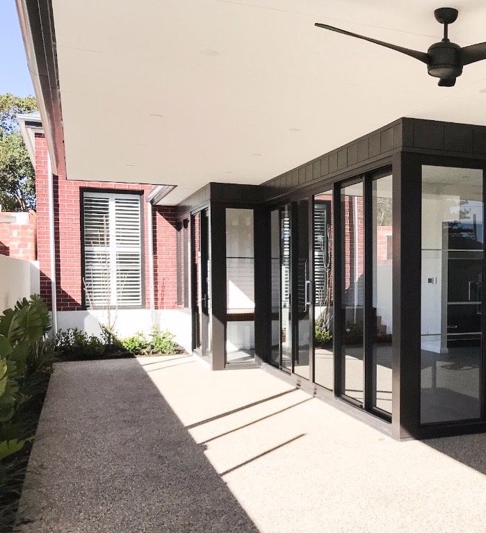
With the Perth property market being somewhat dismal in recent times, an incredible result on a property flip, such as this, is somewhat unheard of. Explore this Claremont home that was sold before it was listed, and even managed to break the street record!
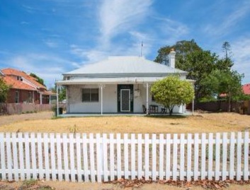
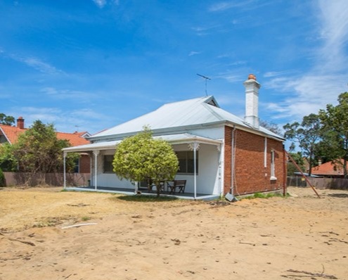
With Perth property market conditions being a little dismal in recent times, a project this size could be considered quite risky in nature. However, Styleline Investments had the foresight to snap up a heritage home on a narrow block with plenty of potential. After putting together a renovation-dream-team with Dasco Building Group and Prince Design, they began working on the luxurious 4-bedroom, 3-bathroom family home that would be.
The Original Home
The heritage home is sat on a large piece of prime-location realestate in the heart of Claremont. The block ended up being sub-divided into smaller, narrow blocks of land, meaning that the renovation team was tasked with creating a large family home, that was no wider than the existing house structure. The team had to attempt to create a luxury home, worthy of this prestigious location, whilst preserving and restoring the historical home.
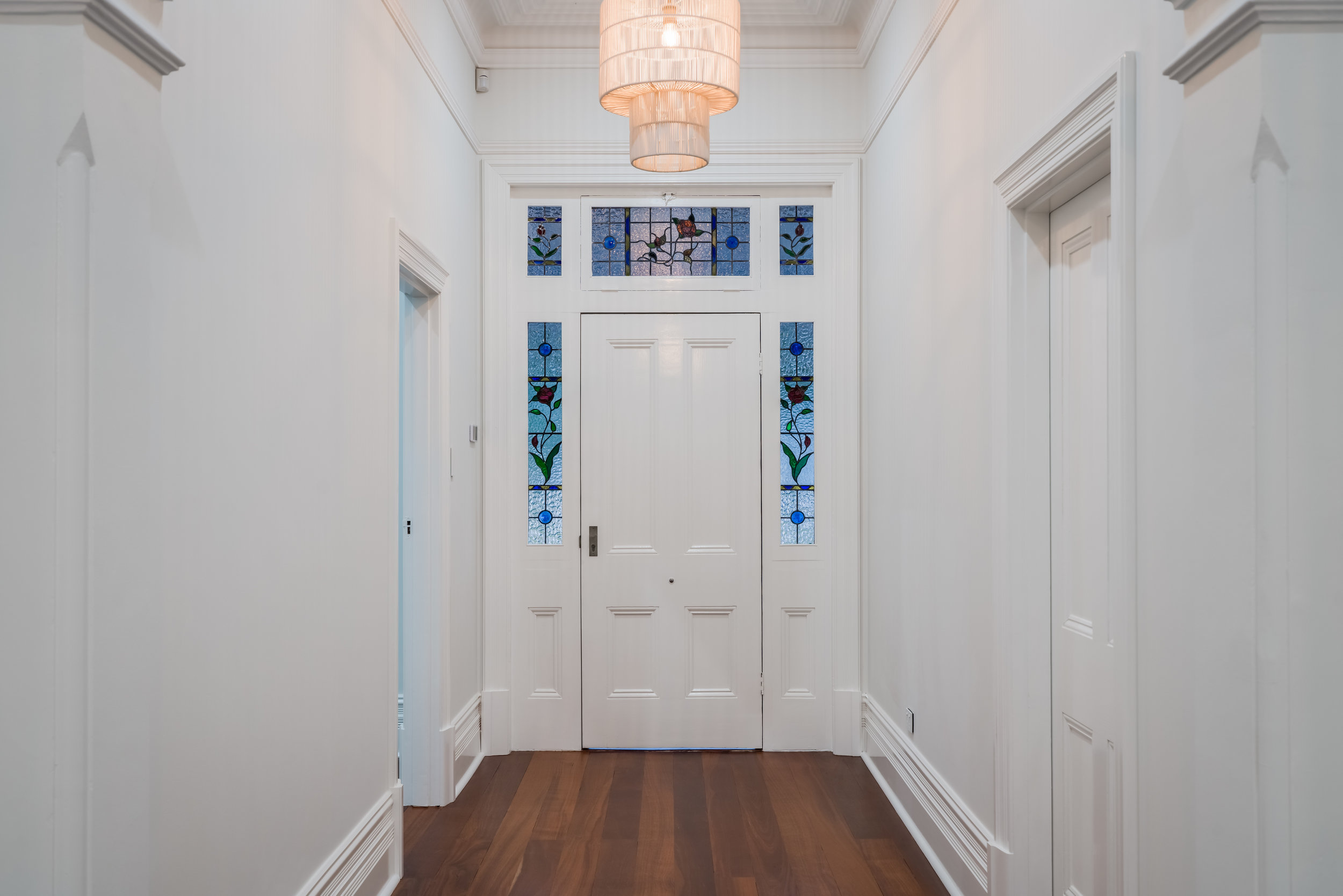
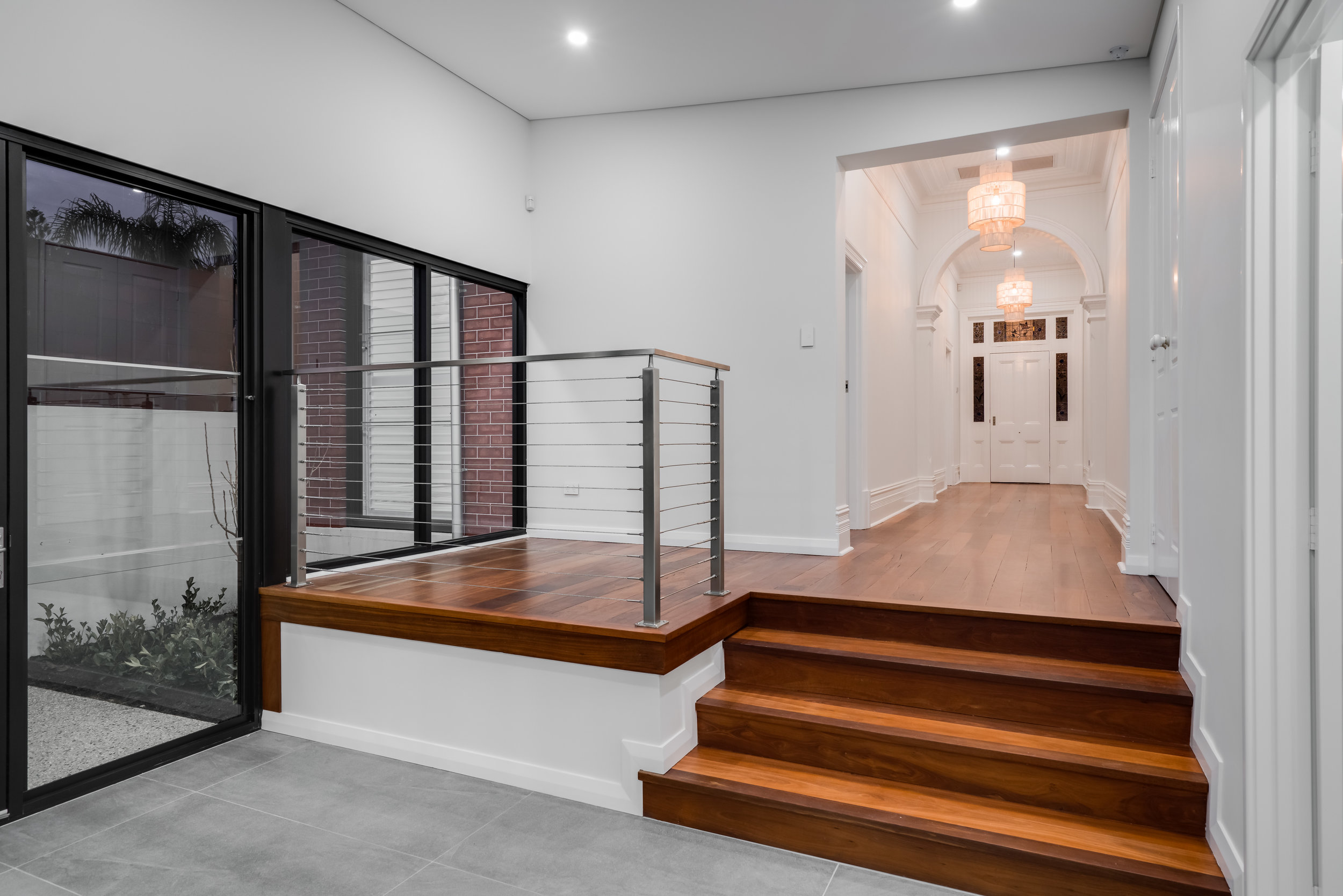
Some clever design and architectural work meant that the team was able to seamlessly connect the old home to the new extension. Dasco Builders perfectly restored the original entryway, which now leads into 1 of the 3 living areas of the home. Many character elements of the home (such as the feature archways) remained in tact, giving the new luxury home a certain charm to it.
The New Kitchen-Living Area
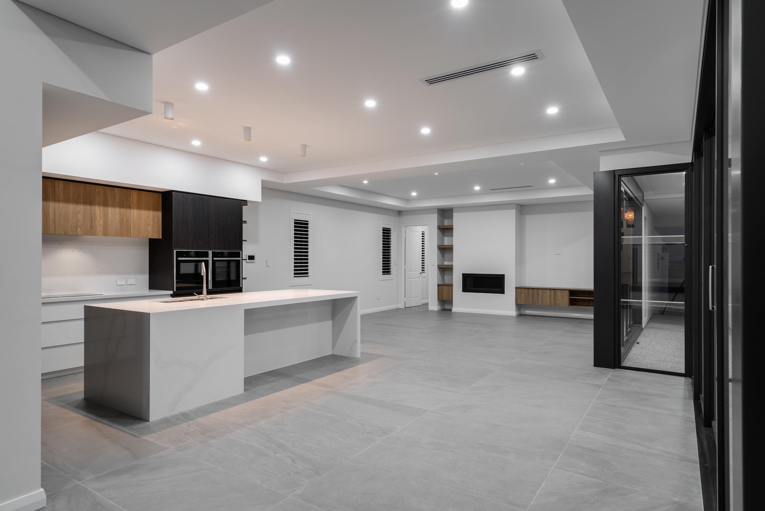
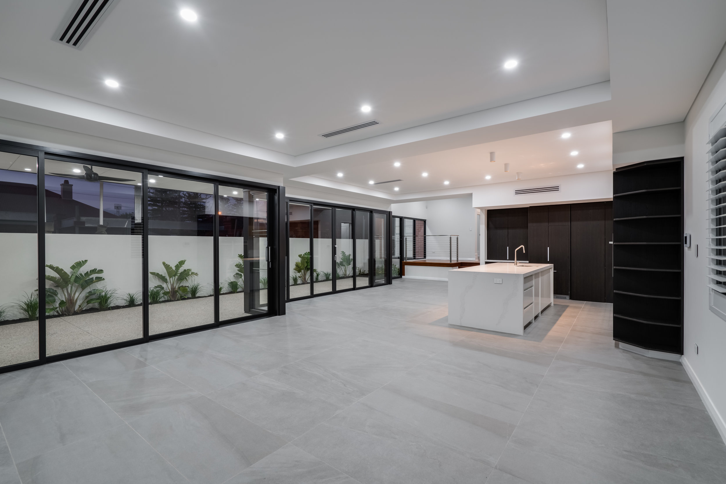
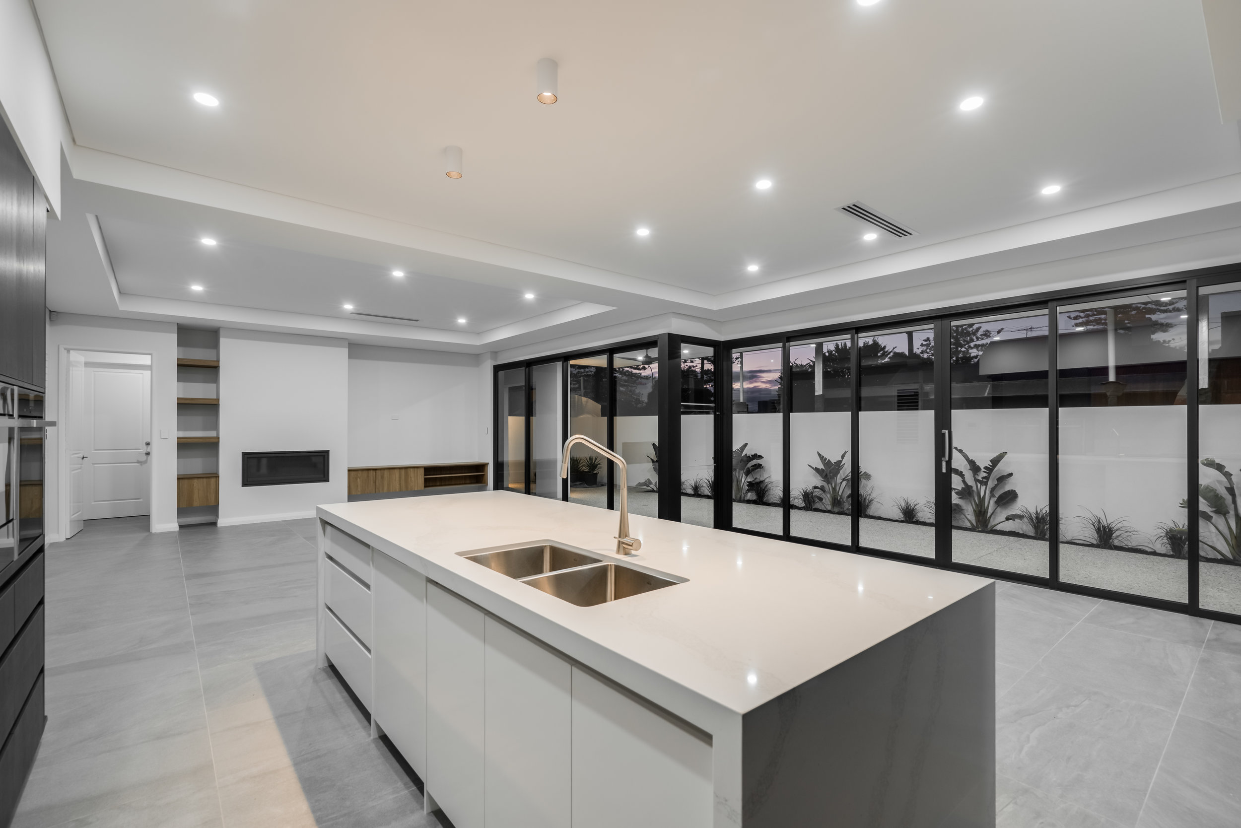
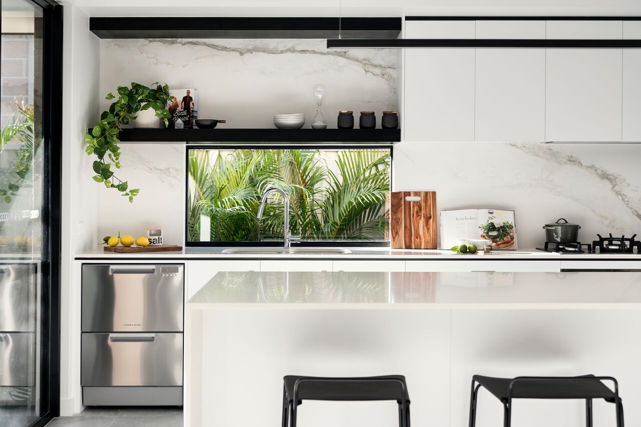
A large proportion of the new extension is made up of the spacious kitchen and living area. High ceilings, large format tiles, gorgeous marble, recessed ceiling and high-end custom cabinetry all contribute to the overwhelming feeling of luxury in this open-plan contemporary space.
The Bathrooms & Powder Room
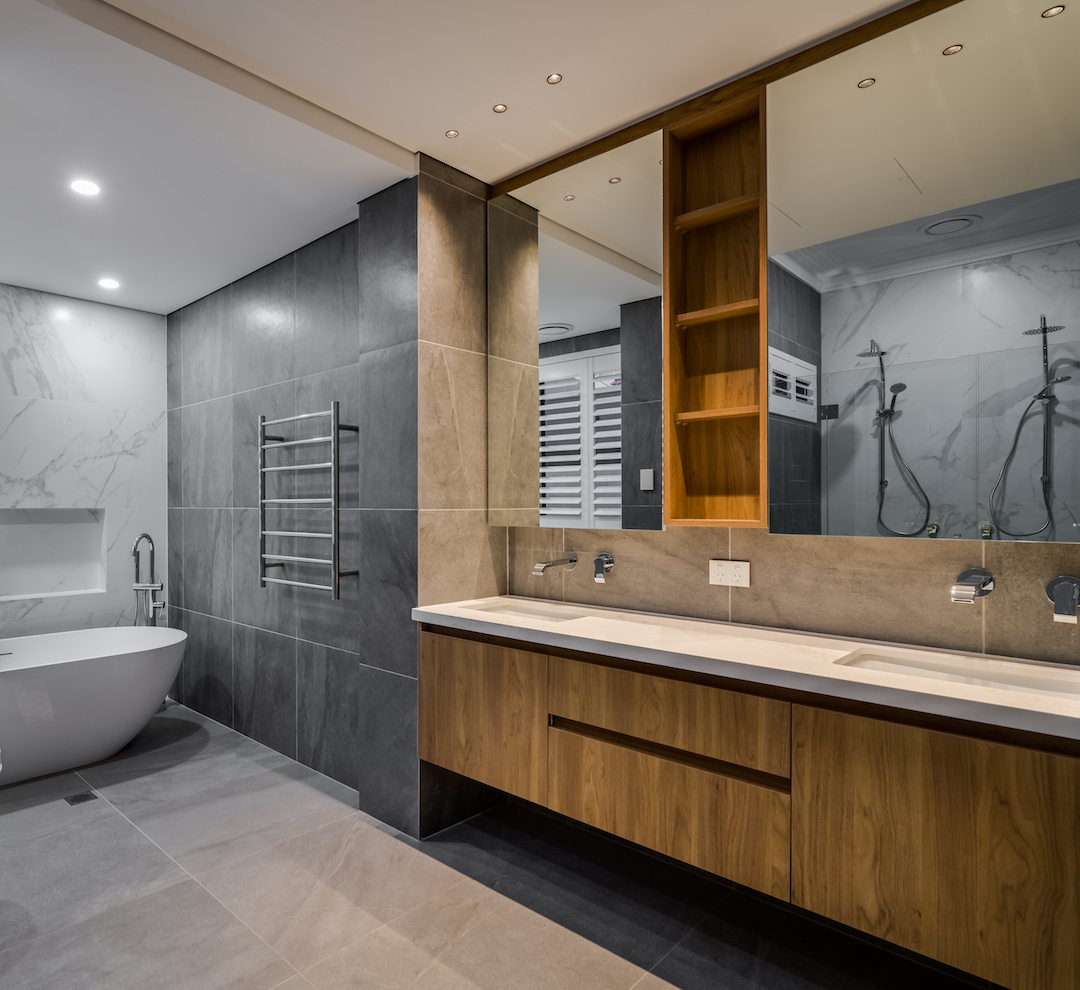
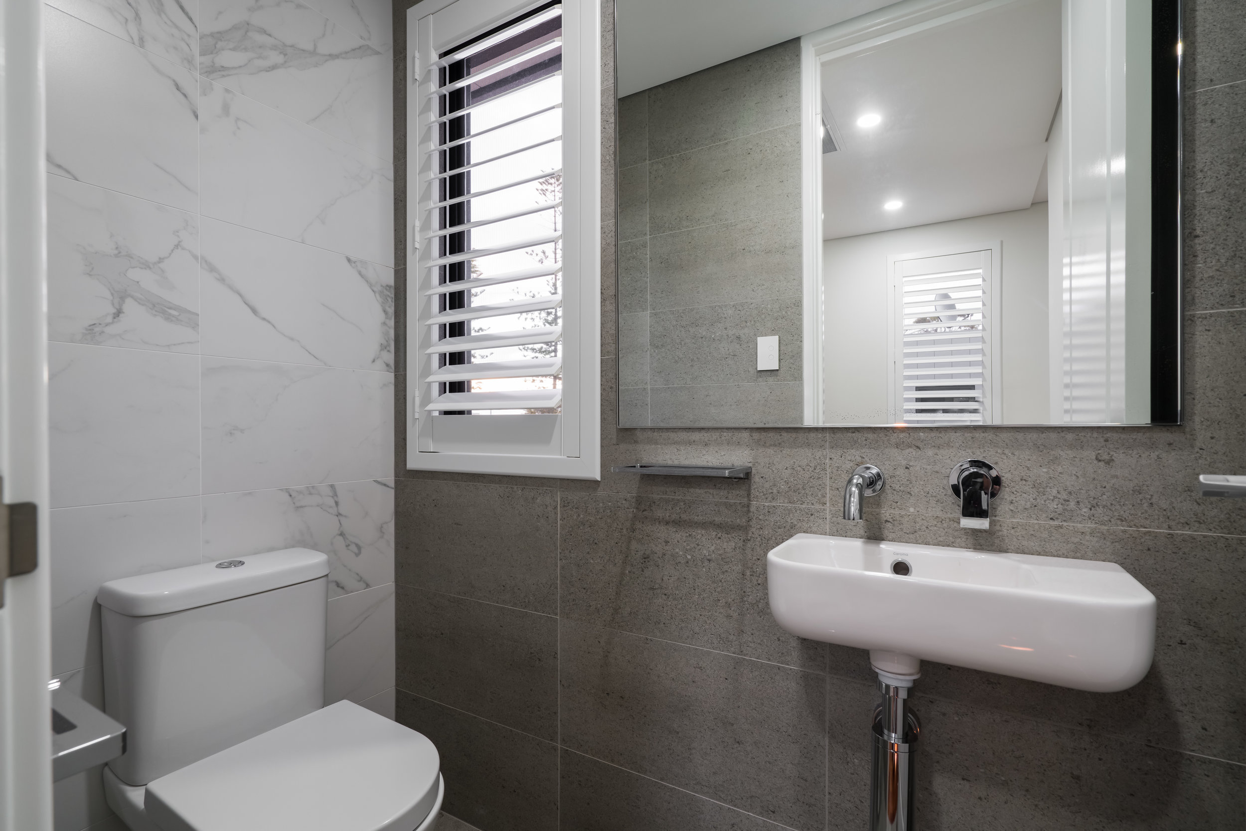
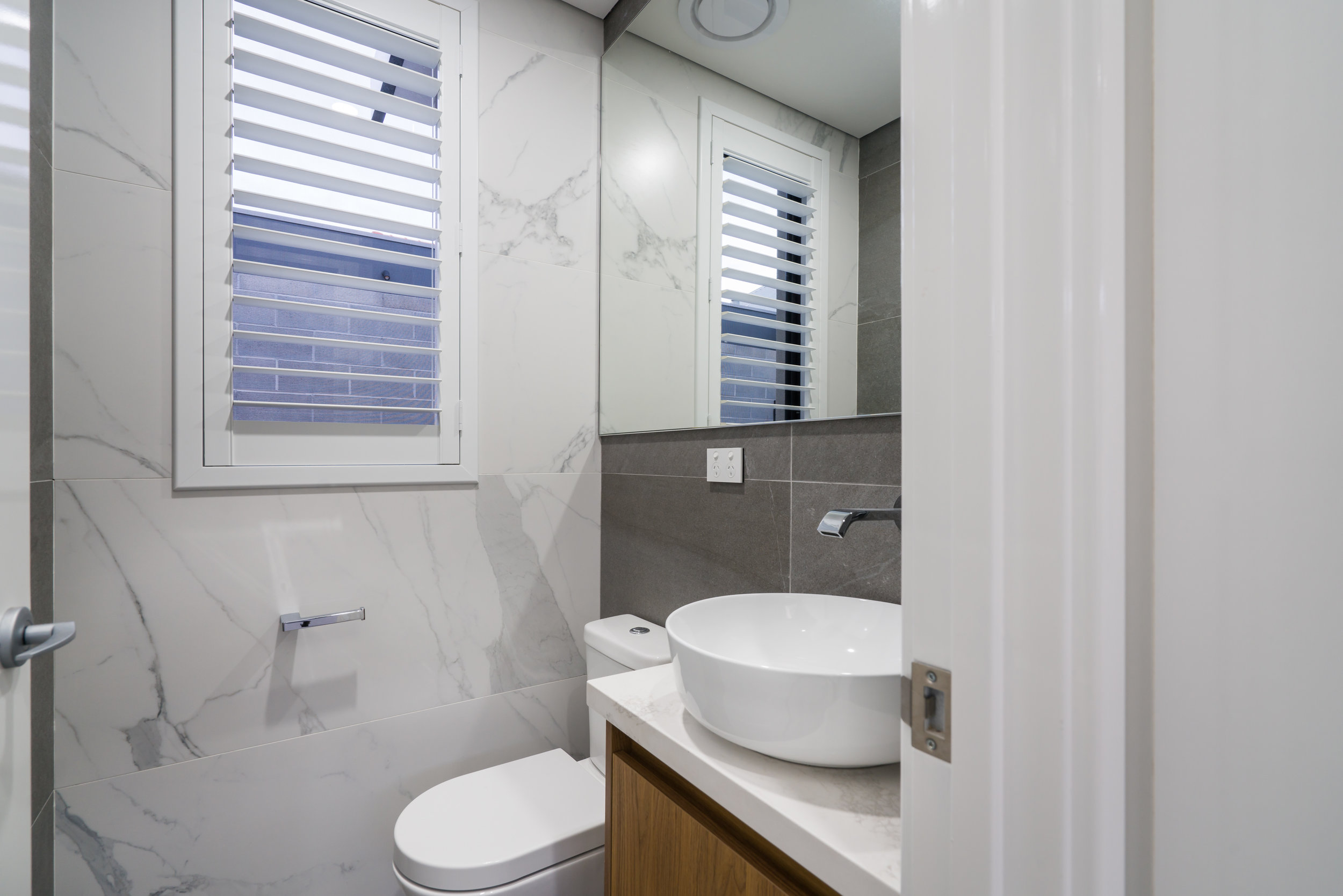
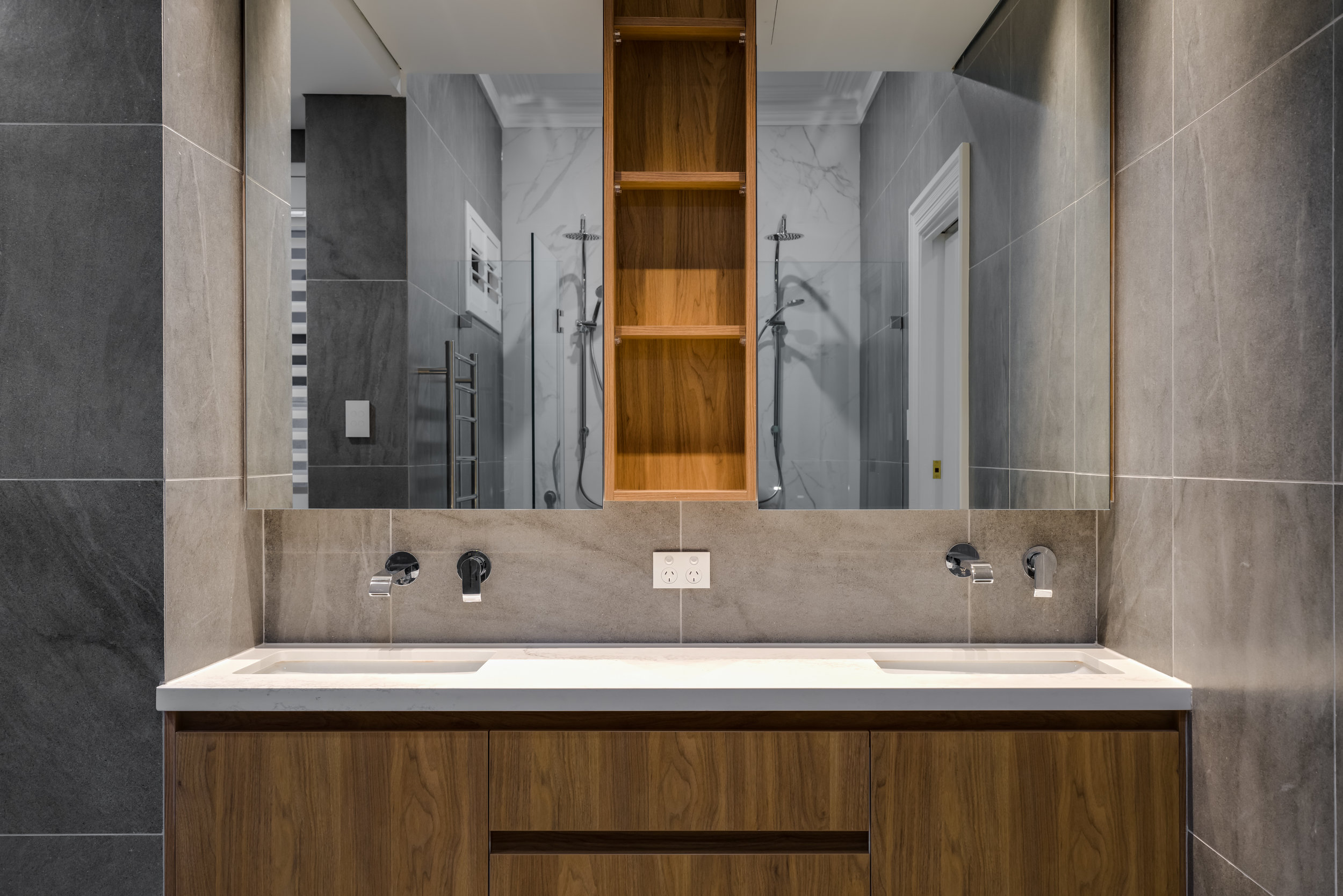
Keeping consistent with the existing colour palette from the main living area, the same custom cabinetry is used throughout the bathrooms and the powder room. The choice of large format tiles make each space look both lavish, and larger. The chrome finishes throughout complete the luxe feel.
The master ensuite does justice to the beautiful home and stunning location, with a breathtaking free-standing bath, large double shower and custom double vanity.
The New Exterior
Much of the building process was consumed by the incredible restoration work which was carried out. However, it was well worth it with the original part of the home looking absolutely stunning and rich with character features. The new extension also made use of an otherwise unused alleyway, meaning that the home could have it’s very first enclosed garage!
If you’re looking at tackling a large renovation such as this, it’s important that you have the right team on your side. We suggest starting with a reputable interior designer, who has the right connections to ensure that you get the best return on your property investment. Here at Prince Design, we would be delighted to offer our experience and expertise, to assist you in your next home renovation, so please do not hesitate to contact our friendly office today.
2019 Trend Alert: Colour Forecast
Your exclusive insight into the colours of 2019! We’ve taken the pleasure of constructing three stunning colour palettes that reflect the three biggest colour trends of this year. Explore the inspiration and artistic meaning behind the Antiquity, Serenity and Twilight palettes.
Antiquity Palette
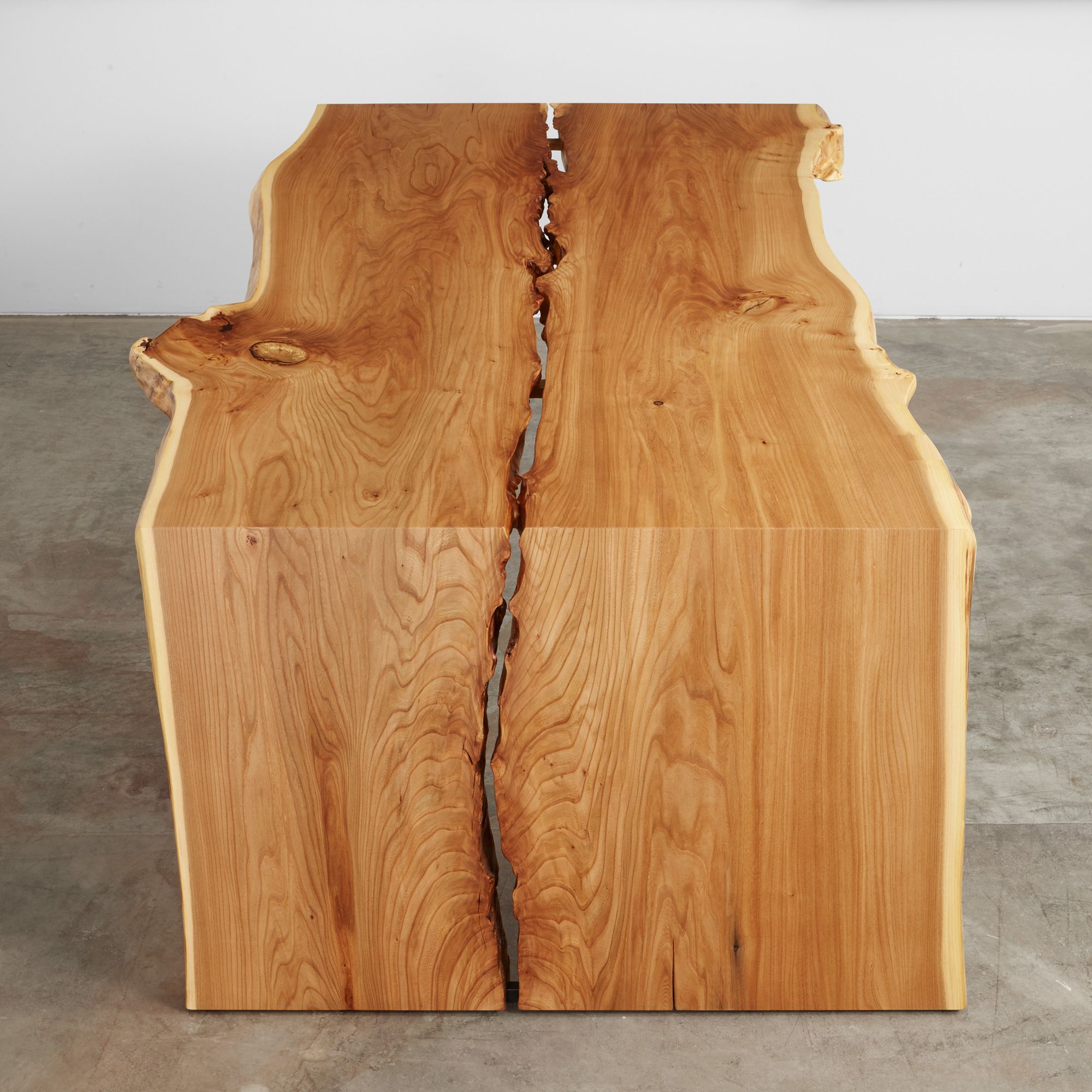
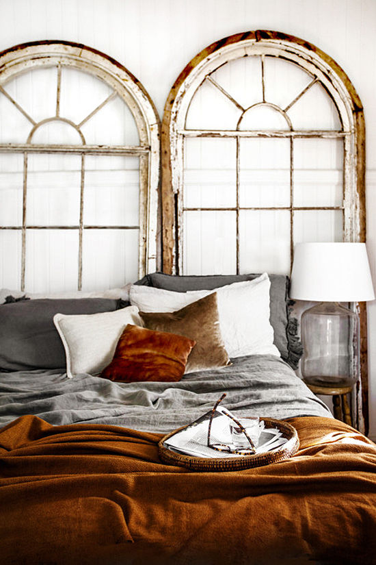
Think gorgeous aged wood, deep orange hues and dark green compliments…it’s time to go back to our roots and reflect on the past. The Antiquity Palette embraces the imperfections in life and highlights the authenticity they create. These gorgeous earthy tones encourage us to reflect upon the past and carry it through into the modern era.
Many designers are incorporating more of these natural, earthy tones with textured finishes into their work. Many clients are requesting hand-made furniture pieces and are looking for perfectly imperfect items, such as tables with split wood.
Serenity Palette
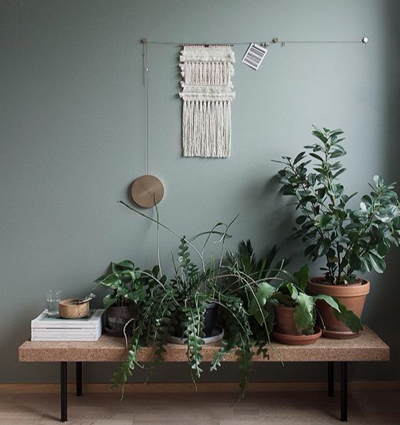
Inspired by nature and simplicity, the Serenity Palette combines a spectrum of beautiful deep and light greens, balanced by neutral tones and light natural wood. Much like the Antiquity Palette, the Serenity Palette embraces the imperfections and rawness of nature and looks towards a more sustainable future.
2019 will be seeing spaces that feature paired-back styling, subtle references to the natural world and a noticeably calm atmosphere.
Twilight Palette
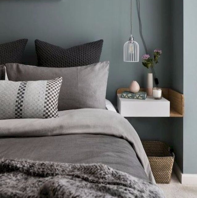
In contrast to the innocence of the previous two palettes, the Twilight Palette creates a moody, dark and mysterious ambiance. The bold and daring nature of the palette draws people into it’s mystifying atmosphere. The palette demands the use of organic compounds and materials, such as marble and granite. Again, this palette wishes to embrace the natural elements of these materials, such as marble with imperfect yellow veins.
The Twilight Palette brings sophistication to spaces whilst incorporating hard, smooth surfaces. This year will see plenty more daring spaces, with plenty of drama and ‘wow’ factor.
If you’re interested in expressing these colour palettes within your home, we’d be delighted to guide you! Contact the Prince Design office today to book your first colour consultation!
Allergies in the Home: The Impact of Furniture Selections
Whilst having allergies is quite commonplace nowadays, people are still quite unaware about how this should impact their furniture selections. The latex used in memory foam in sofas, the harmful emissions from glue used in cheap furniture and the toxic chemicals used to treat fabric can all cause allergic reactions! So, let’s explore how Prince Design tackled creating a allergen-free home for a client and her family.
Project Brief
With asthma and allergies (anaphylaxis) affecting both Amanda and several family members quite severely, creating a safe haven where they could recuperate from their sicknesses was top priority.
The 10 year old family home was built with a clean lined coastal, minimalist theme using a very periodic colour scheme of various creams, browns and beiges. The large home was littered with pockets of wasted space, as well as being filled with unusable furniture (which had the potential to trigger life-threatening allergic reactions).
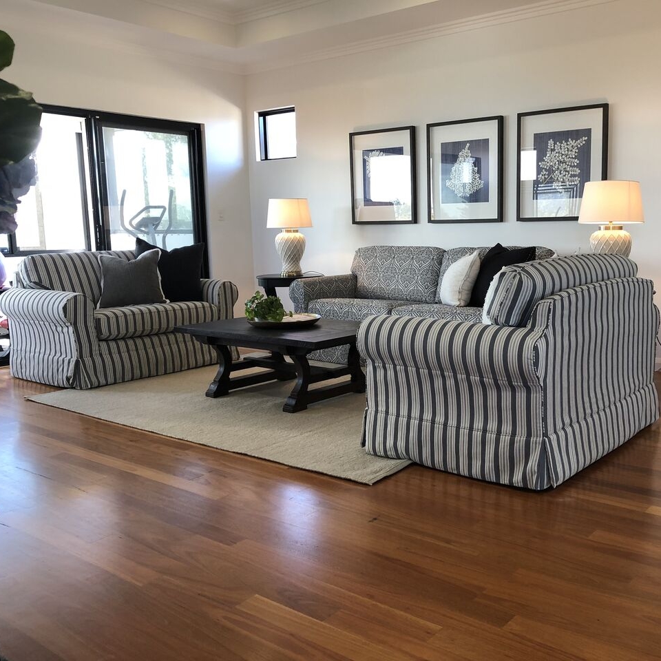
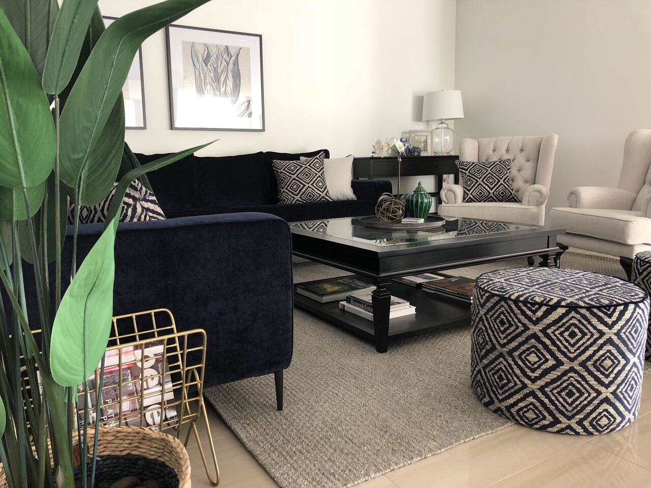
Amanda had a clear vision for her home - out with the old and in with the blue! She also wanted to transform the somewhat sterile atmosphere into one which made the family feel welcomed, inspired and relaxed by creating a softer and more intimate feel.
Overcoming the Causes of the Reactions
Latex
This one doesn’t just affect Amanda and her family - it is easily one of the most common allergies out there! Latex can be hidden away in the foam in sofas - particularly memory foam. I enlisted the help of some experts over at The Upholstery Shop and Henry & Oliver, who were able to create some custom sofas and lounges that were 100% latex-free. In cases such as this, importing furniture can be more cost-effective, but it is often far too risky - many manufacturers will still use latex, even if it has been specified to be made without.
Glue in Furniture Frames
Quality manufacturers will always construct furniture using sturdy nails. However, cheaper imported furniture is often made using a combination of nails and glues. These glues create harmful emissions which can trigger allergic reactions. By using local manufacturers, we were able to specify materials and keep a close eye on the construction process, to ensure that the furniture frames were constructed using only nails.
Fabric Staining Chemicals
Many people are unaware of the harmful chemicals often used to treat fabrics to prevent staining. We were very careful about selecting fabric strictly from Zepel Fabrics and the Oeko-Tex Certified Range from Warwick Fabrics. Being one of the lesser-known triggers for allergic reactions, many people are unaware that this is an important consideration to be made when selecting fabrics for both furnishings and window treatments. To be on the safe side, it is always best to go with Oeko-Tex Certified fabric selections.
Throw Cushion Covers & Fills
The fabric choice for the throw cushion covers had to be made from quality all-natural materials such as linen and cotton. To help prevent dust collection on the cushions, we also ensured that the covers were machine-washable.
We ran into a bit of a challenge when it came to the cushion fills, as feathers were not an option. I spent a considerable time researching the potential options and was able to source cushion fills made from recycled PET bottles. These were trialled in Amanda’s home before she purchased them, to make sure that they would be tolerated.
The Result: Words from the Client
After many hours of consultation, sourcing and testing out different materials, we were able to create that safe haven that Amanda and her family so deserved. Here’s what she had to say about the final result:
“Tamlin has created a feeling of comfort and warmth that has revolutionised how we use the space in our home and how we interact as a family”.
“The end result was amazing and vastly exceeded the expectations of my family (who were extremely doubtful of the choices for materials and colour swatches they were shown).
Although I had helped choose the colours and pieces, seeing it all styled together with some lovely extra surprise touches was overwhelming and the entire family was speechless with the amazing end result. Tamlin has created a feeling of comfort and warmth that has revolutionised how we use the space in our home and how we interact as a family. I would recommend her work in a heartbeat.”
If you or your family are struggling with managing your allergies within your home, you may want to consider seeking the help of a professional. Prince Design has the experience needed to create a safe haven for you and your family. Contact our friendly office today to see how we can help.
*Please note - client name has been changed for confidentiality purposes.
Brighten Your Space with the Latest Lighting Trends
Lighting selection is one of the most crucial yet complicated elements of any room. So, let’s explore some of the biggest trends from 2018 and see what is set to take the scene in 2019.
This makes the selection process crucial and complicated - you have to consider functionality, style of the room, atmosphere and trends. It certainly doesn’t help that these lighting trends are constantly changing and evolving. So, let’s explore some of the leading lighting trends for 2018, and see which ones are set to be big in 2019.
Mid-Century Modern
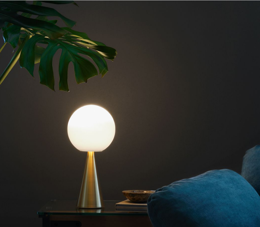
In case you hadn’t heard, Mid-Century Modern has been dominating the lighting scene for quite some time now. Over the past several years we have seen the devotion to this trend return to the fore with colour pops, gloss enamel pendants, clean lines and a slight nod to kitsch.
This particular trend has always been a personal favourite of mine – such a classic and sophisticated look!
Although still hugely popular, we are starting to see people shift to an Art Deco meets Modern style.
Art Deco Meets Modern
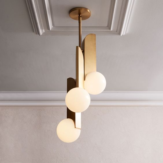
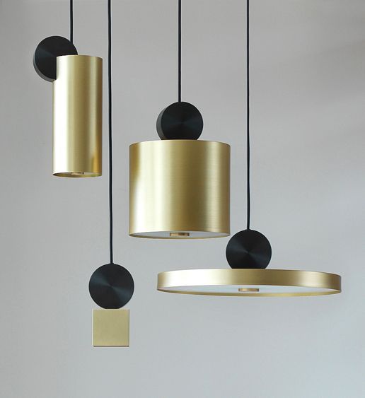
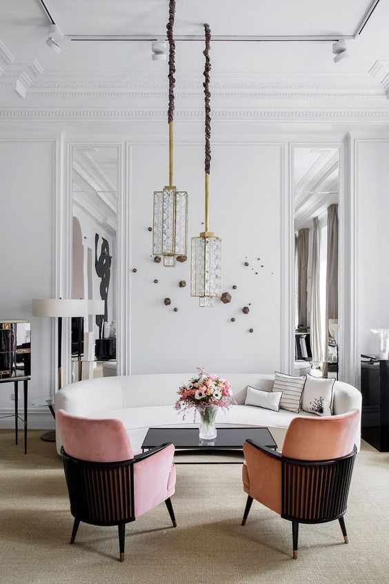
There has been a very recent resurgence of the classic Art Deco style, but this time, with a mix of Modern too. Fixtures are going back to artisanal production, using materials with brushed brass, nickel, textured fabric cables, exposed conduits and oversized coach lighting.
Traditional Art Deco isn’t for everyone but adding in these Modern Contemporary undertones makes this trend an edgy crowd-pleaser. With more and more people starting to move away from Mid-Century Modern, it’s quite possible that Modern Art Deco could be the defining trend of 2019.
80’s Retro
Some of the new emerging design styles are making subtle reference to 1980’s retro design. We are seeing lights coming in a variety of retro rainbow coloured glass and bright powder coats (which means those 80’s neon lights don’t seem to be making an appearance anytime soon – thank god!).
In the Mood
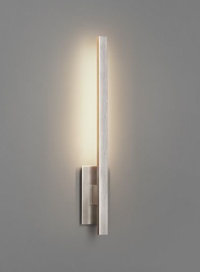
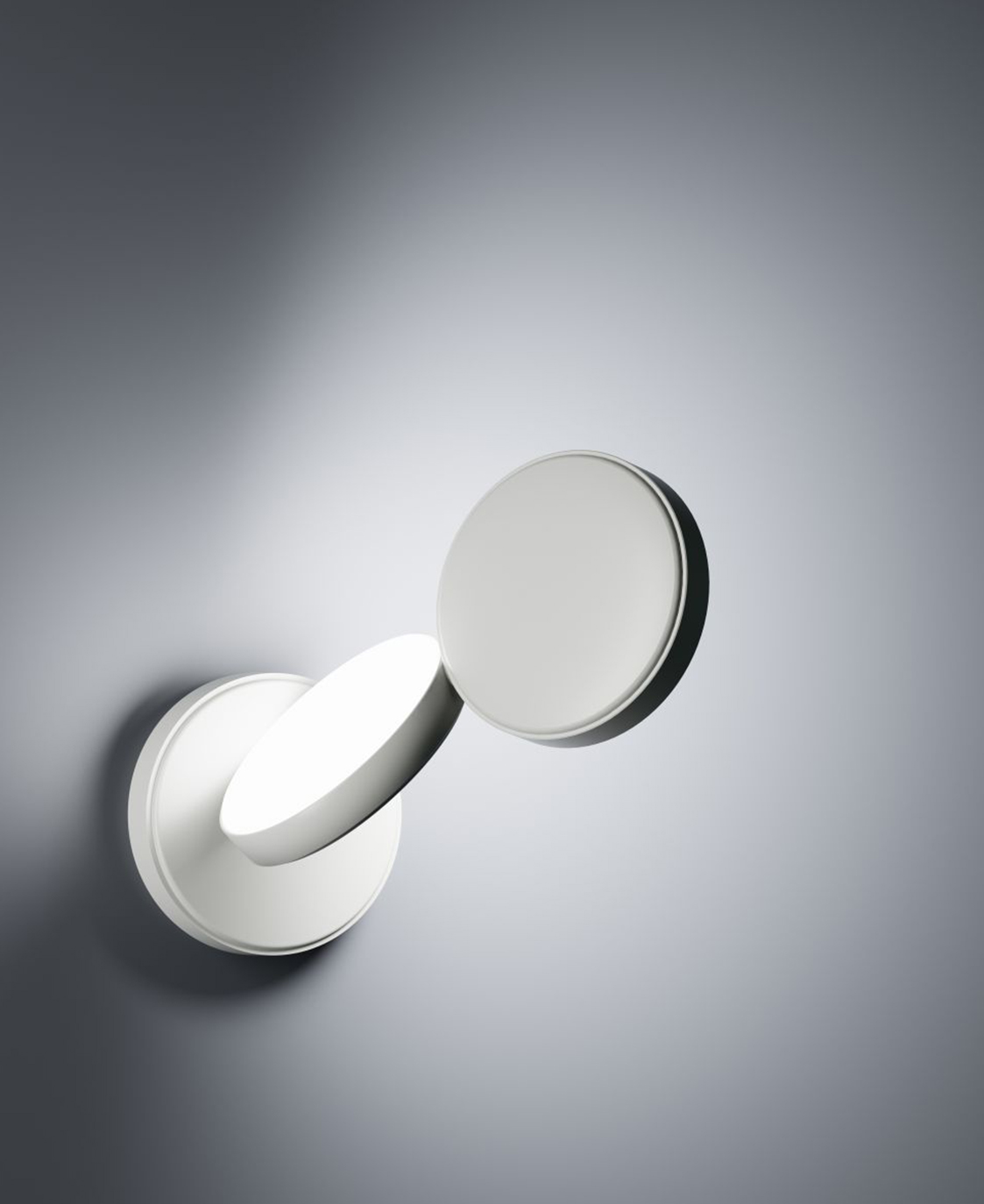
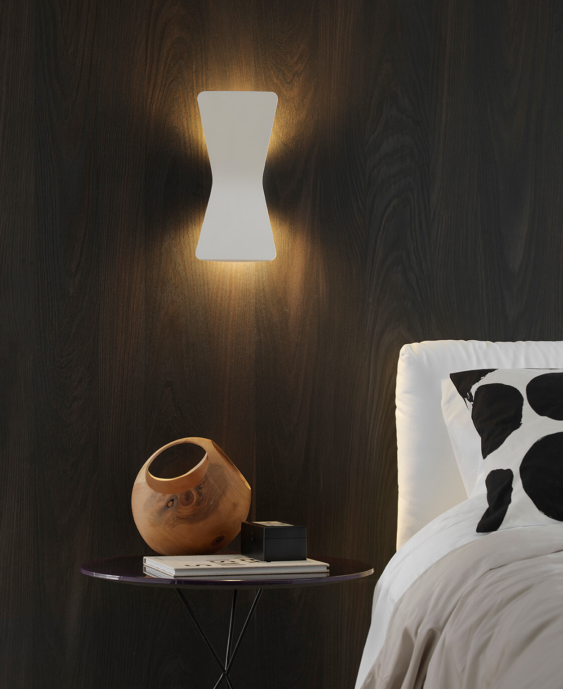
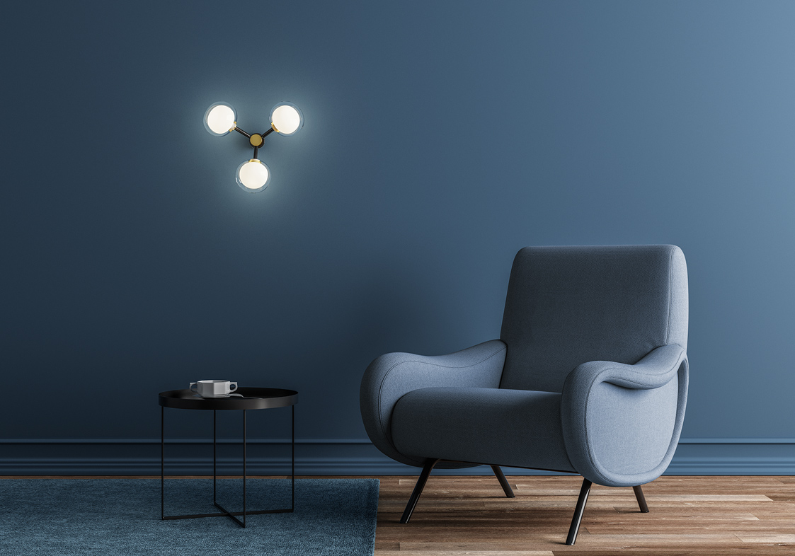
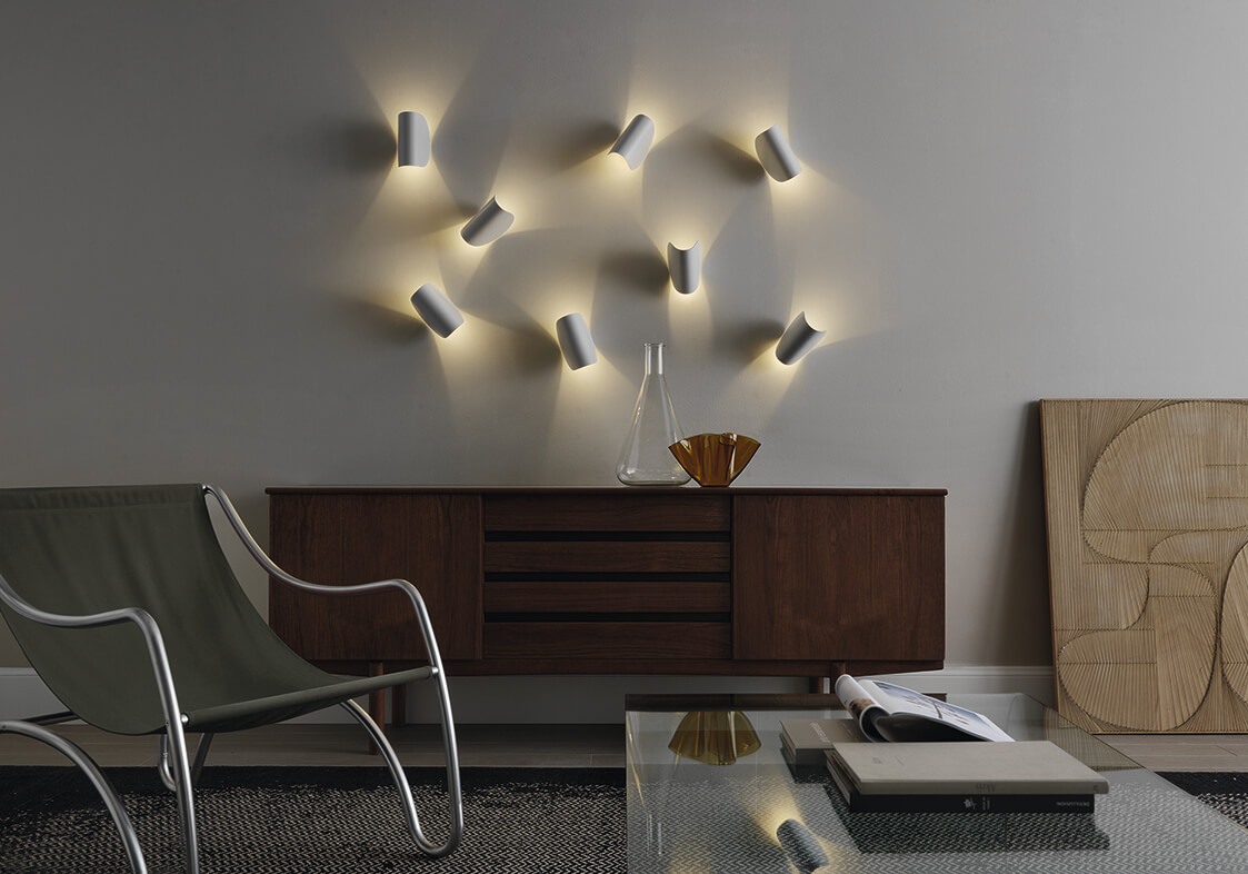
Indirect lighting is back on the scene, creating moody atmospheres in every space. When it comes to lighting, less is more – don’t sacrifice atmospherics for bright and over lit fixtures.
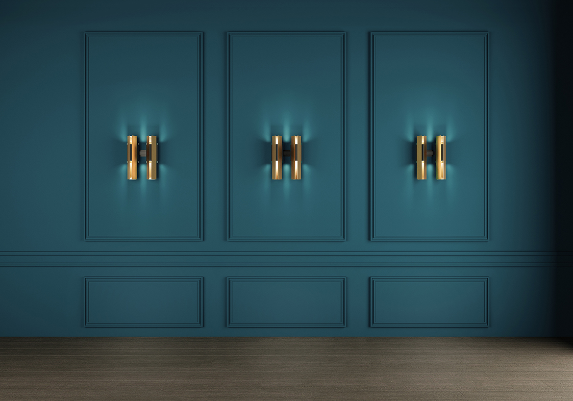
This atmospherics trend has brought with it a growing popularity for traditional wall sconces. In fact, many people are consistently favouring wall sconces over ultra-modern LED recess fittings. This pared back look creates that desired moody effect.
These wall sconces can create beautiful features too, often removing the need for large artwork.
If you find that you’re struggling with balancing functionality, styles, atmosphere and trends with your lighting selections, consider hiring a professional. Prince Design can assist with making lighting selections for any residential or commercial project, so contact us today to book your first consultation.
Need some more inspiration? Head over to our Instagram page to see some of the latest lighting trends in action.
We’d like to give the experts at Radiant Lighting a huge thank you for providing us with their insight and beautifully imagery, which was used in the creation of this blog post.
A Guide to Natural Stone Trends for Outdoor Spaces
As we finally reach the warmer months, it’s about time that we start thinking about dusting off and refreshing our outdoor living space!
As we finally reach the warmer months, it’s about time that we start thinking about dusting off and refreshing our outdoor living space!
We’ve got the inside scoop on the five key natural stone trends for outdoor spaces this coming summer!
Texture
Natural stone is a classic and beautiful choice to create a truly unique outdoor space. This year is all about enhancing natural elements of the stone, which means the more texture the better!
Textured nature stone has a beautiful tactile appearance, feels lovely underfoot and gets better with age.
We are also seeing a rise in the popularity of large format tiles in tumbled or distressed finishes.
Crazy Paving
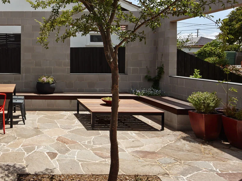
The popularity of crazy paving doesn’t seem to be going anywhere this summer! However, we will be seeing more influences from the natural texture stone trend.
The beauty of crazy paving is that it is ideal for all sorts of areas - From small outdoor living spaces to large courtyards and driveways.
A great feature of crazy paving is that the variation of sizes between the pieces make it perfect for working with curves in garden, landscape or home design.
Large Format Tiles
If you remember our blog post on Large Format Tiles from a while back, we spoke about how they are an incredible tool for opening a space up!
They look absolutely stunning in indoor-outdoor living spaces, but can also be used for outdoor cladding and feature walls.
One Palette
Keep things simple and easy by adopting one palette! One palette is all about using one stone as the flooring and walling surface, and/or using the same stone from inside to outside.
This popular trend creates an impactful look and feel to take any space to the next level!
Customisation
Last but not least we have customisation!
Make your space truly unique and fit for your own lifestyle by adding in customised features! Take this gorgeous custom outdoor kitchen and pizza oven designed specifically for this space for example.
A lot of people are also now leaning towards using custom benchtops and sinks, which look fantastic when they’re carved from solid blocks of stone!
Need some help navigating these outdoor styling trends, or want to know how to make your outdoor space fit your lifestyle? Then feel free to contact our office at info@princedesign.com.au to book your first consultation today!
A huge thank you to Ecooutdoor for giving us plenty of images and insider knowledge on these trends!


